London's Design Museum has reopened its doors with an exhibition that charts the evolution of electronic music and its symbiotic relationship with design. Curator Gemma Curtin shares five must-see exhibits from the show.
After a slightly delayed launch due to the Covid-19 pandemic, the Electronic: from Kraftwerk to the Chemical Brothers exhibition is on view from now until 14 February 2021.
It has been adapted from a show originally debuted at the Philharmonie de Paris's Museum of Music last year and tweaked to feature a greater focus on UK rave culture, as well as highlighting how design and electronic music can come together to create more impactful experiences than either could separately.
"Because it is so abstract, electronic music needs to collaborate with design in order to present itself to the world," said Curtain.
"And designers enjoy working with DJs because they give them the freedom to respond to their music in different ways. Whether it's through vinyl sleeves, the interface of a Roland synth or incredibly technical and complex live AVs [audiovisuals], the exhibition is very much about telling that untold story of the connection between design and music."
This is achieved with the help of a soundtrack curated and mixed by French DJ Laurent Garnier, as well as 400 exhibits spread across four sections – Man and Woman Machine, Dancefloor, Mix and Remix, and Utopian Dreams and Ideals.
These explore the genre via the technology through which it is made, the club culture that surrounds it, the practice of DJing itself and finally its social and political implications.
"It's a broad brush through the genre to show its cultural impact and all these satellite creative elements that work with the music and make it into something more," said Curtain.
"It's also about showcasing all of these creative talents that work in this field. Of course, this massive industry which supports so many livelihoods is on hold at the moment. But I hope the exhibition gives people a chance to feel and to remember and hopefully ultimately to make sure that this isn't lost."
Below, Curtain shares five designs from the exhibition that showcase the synergy between the two fields at its finest.
The Visitor by Yuri Suzuki and Jeff Mills
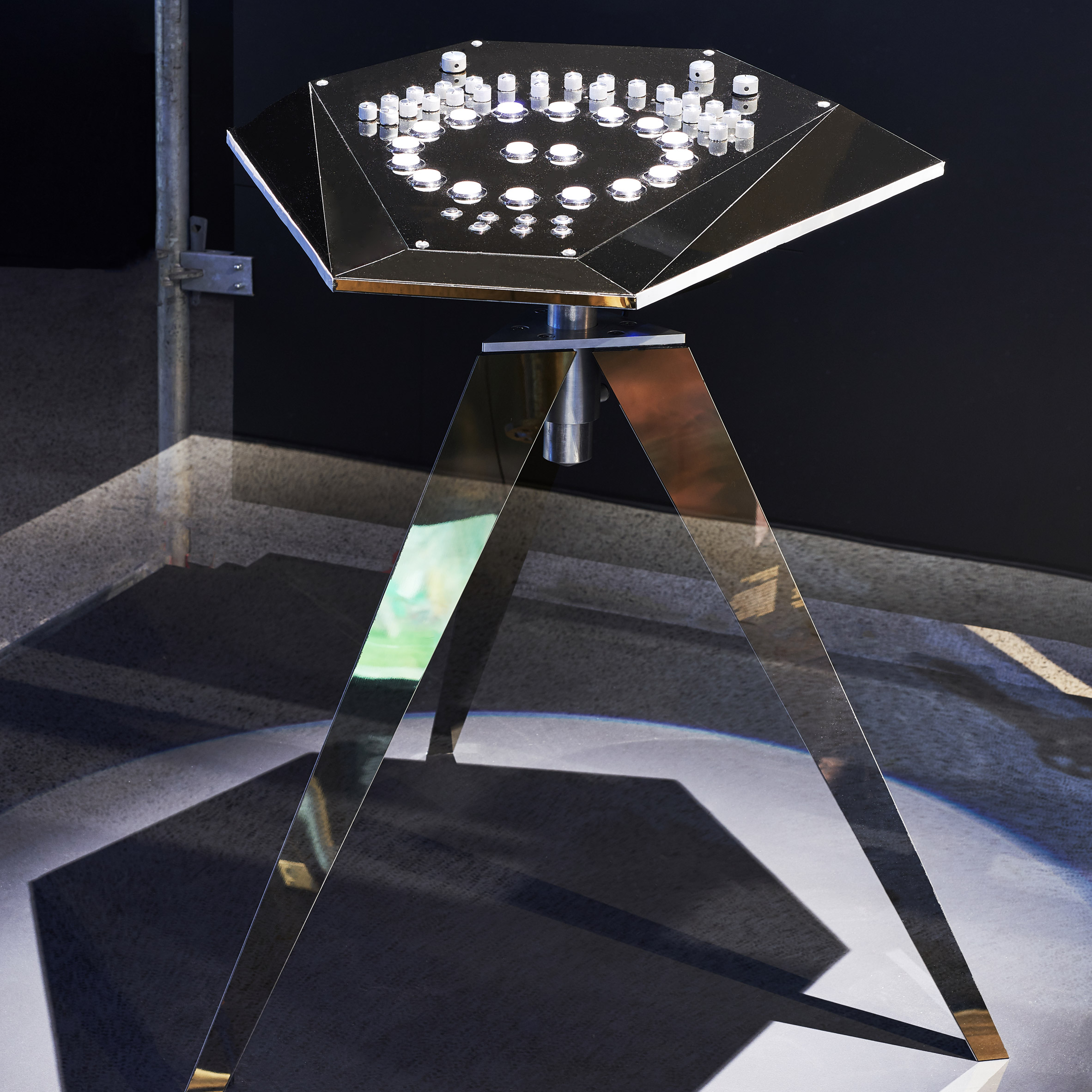
Jeff Mills is a DJ who was there, in Detroit, at the birth of techno music. He's a genius, some people say. And he used to play on this Roland TR-909 drum machine from the '80s.
It was really battered, he'd used it so many times. But actually its buttons are quite slender, the slides are quite close together. And his speed when mixing is such, that he wanted a new interface for using it.
He worked with Yuri Suzuki, the Pentagram partner, sound artist and product designer, to actually take the electronics from his Roland and put them into this shiny, spaceship-like desk. Suzuki used gaming buttons, which he arranged in a circle because Mills felt this would be a much more effective set-up for him.
The legs are a reference to a Los Angeles Times photograph from the 1940s, of these searchlights roaming the sky above the city. They were looking for bombers but there was this urban legend that they actually found a UFO. Suzuki used the imagery of these searchlights as a reference for the dynamic legs on this machine, to create a product fit for presentation and performance.
Aphex Twin's Collapse album by Weirdcore
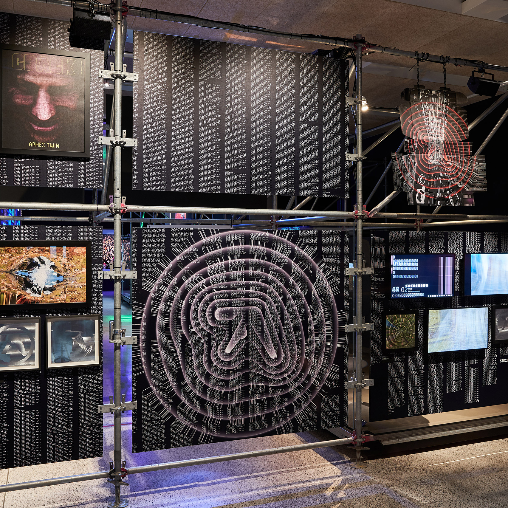
We contacted Weirdcore because we wanted to show how he created the visual identity for the Collapse album by his longtime collaborator [English musician] Aphex Twin. Weirdcore's design process essentially involves using digital software, to create this very intense, almost disturbing imagery that he describes as seeing through the eyes of a hallucinating android.
To try and show the process behind that, we created an installation of various different screens. One shows some initial, raw footage he took of Cornwall, which is where Aphex Twin is from, and then another shows how he manipulated these images to crumble and deconstruct. You can see how he uses the sound data, the beats per minute to guide the visuals.
We also see the final video, which went on to inform the live performance and the promotional materials around that. It's a good example of how design is not just the album. It's also the video, it's the live audiovisual (AV) it's all sorts of things, that are now part of the presentation of music.
Haçienda club designs by Ben Kelly and Peter Saville
Tony Wilson, one of the founders of Factory Records, opened the Haçienda club in an old yacht showroom in the middle of Manchester in 1982.
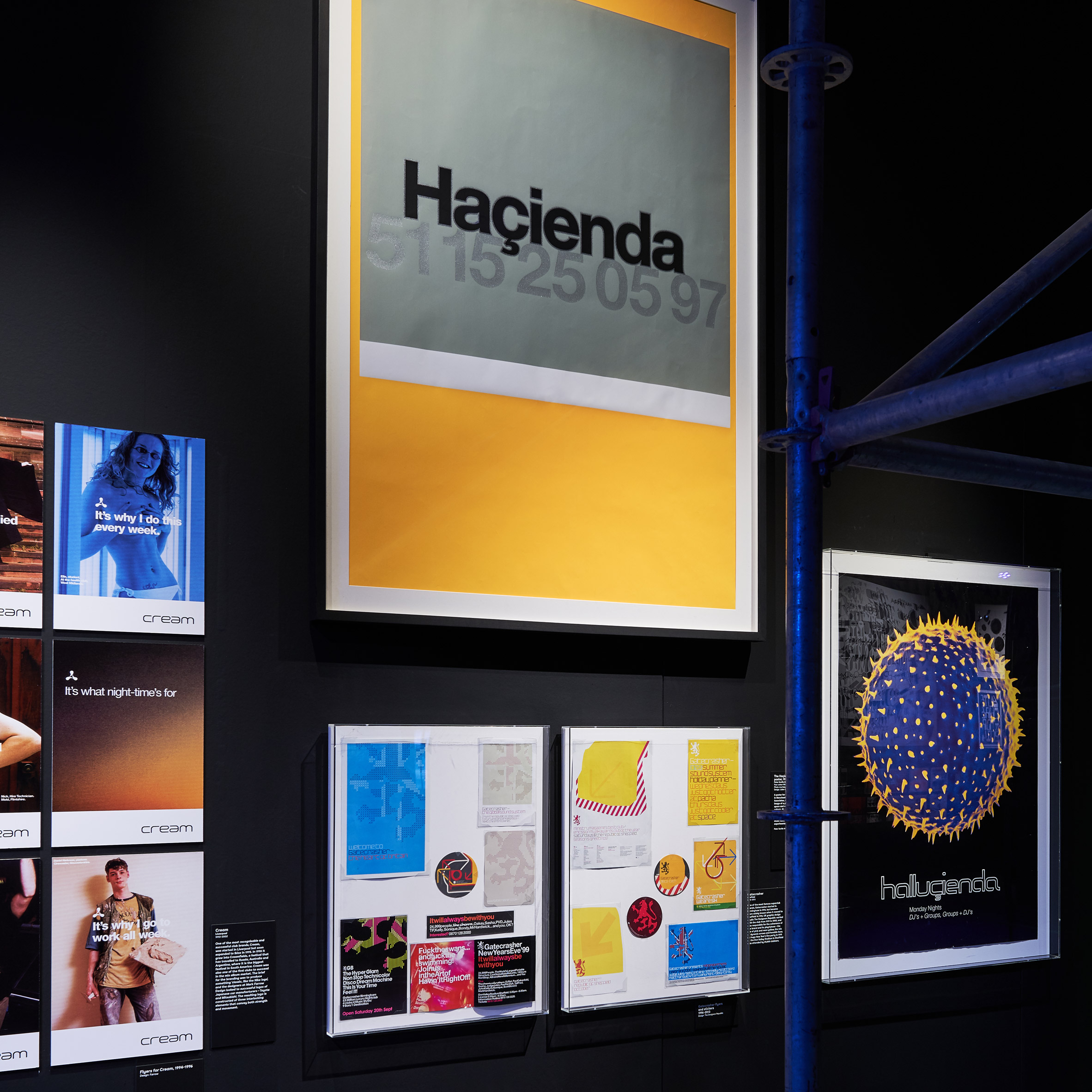
This was really the start of super clubs in the UK and it was people like Wilson who really started investing in design. He got Peter Saville to do the graphic design and Ben Kelly did the interior.
It's no longer any old church hall or basement in a sports centre with a few lights – these are designed interiors. Kelly used bollards and other elements that you normally see in the public realm and this visual language became a really identifying element for the club. The exhibition features a neon sign that hung above the bar and a replica of one of the columns.
Haçienda had a very slick, professional approach to its graphics and identity where before it was all photocopied or hand-drawn flyers. And this went on to influence other big clubs that helped to regenerate inner cities. The Hacienda did a huge amount for Manchester, much like Gatecrasher in Sheffield or Cream in Liverpool.
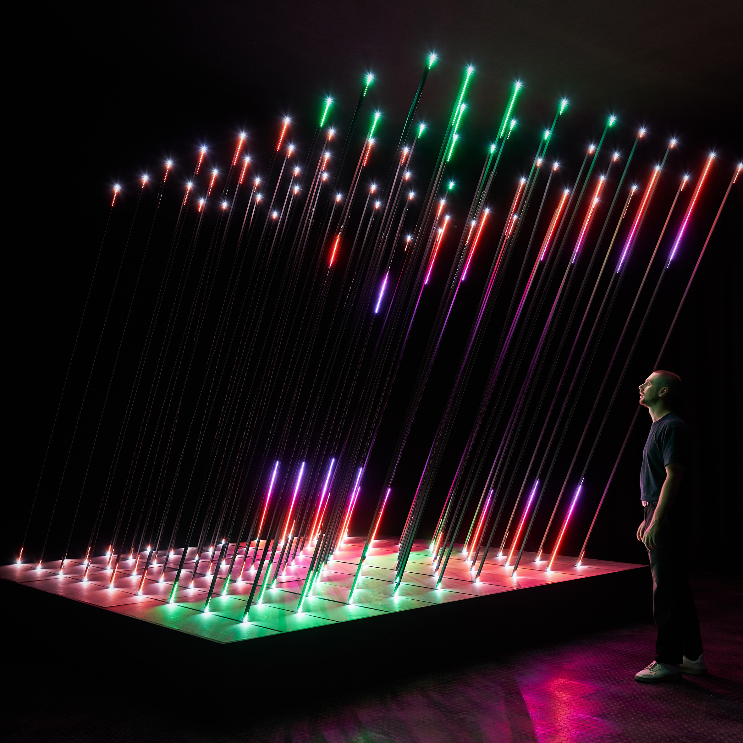
Core by 1024 Architecture
One of the key elements of the exhibition is its soundtrack, which features mixes that span the history of electronic music. So there is a Detroit mix, a Chicago one, a German one. And in the middle of the exhibition is an installation by 1024 architects called Core that is responsive to the sound.
It consists of 24,000 LED lights and 81 of these incredibly tall, three-metre LED rods. The installation offers another interpretation of music through visual means and gives visitors a moment of pause in the exhibition where they can really enjoy the soundtrack.
One of the unique characteristics of electronic music is that it is generally 120 beats per minute. That is really what separates it from other music because you're not reliant on the speed of the drummer. And seeing the music visually makes you think about this pace in a very immersive way.
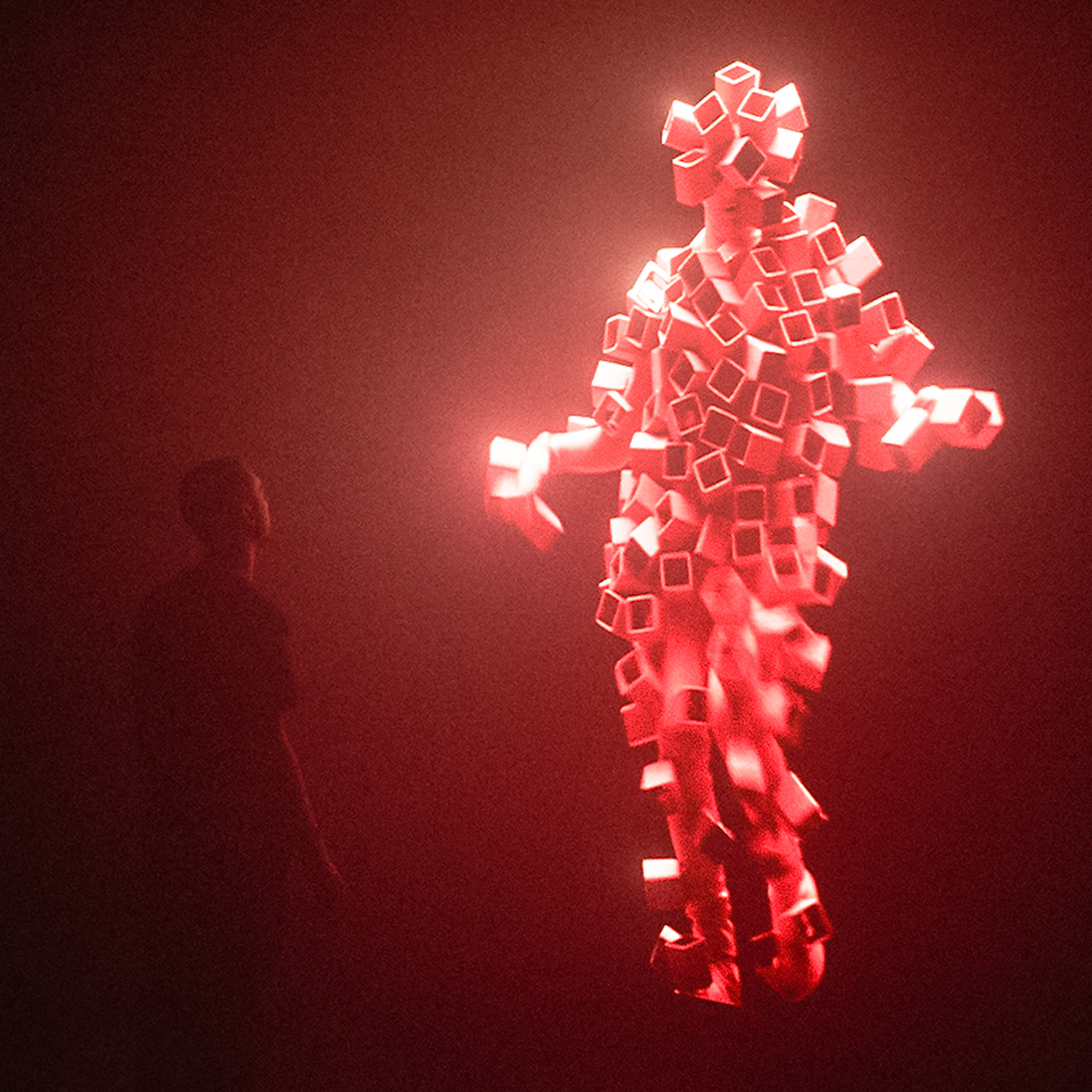
Got To Keep On installation by Smith & Lyall
A lot of the time, digital design is used to present electronic music. But with Adam Smith and Marcus Lyle, the creative directors for the Chemical Brothers, their work is actually based on film. So their practice involves this huge team of creatives including live performers, choreographers, costume and lighting designers.
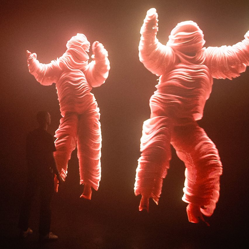
We asked them to create an experience for visitors as they leave the exhibition and the result is an installation based on the song Got To Keep On.
There's a huge floor-to-ceiling screen showing a video of dancers dressed in these incredible outfits, huge and bright pink almost like Teletubbies. There are light effects and haze – you feel like you're immersed in a live performance.
For everybody who's experienced it, the contrast between being stuck at home during Covid and entering this room is quite extreme. It's this visceral reminder of our senses.
It's not just visuals, it's the beat that's vibrating through your body. We unpack all of the detail throughout the exhibition but the reality is when you're in there, you just feel it.
The post Five exhibits from Electronic at the Design Museum that recall the joy of live music appeared first on Dezeen.
https://ift.tt/2PzJTcL
twitter.com/3novicesindia
No comments:
Post a Comment