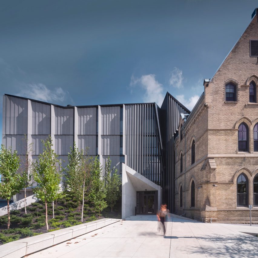
Architecture studio NADAAA has renovated a Neo-Gothic brick building and added a sculptural addition with a jagged roof to house the design school at the University of Toronto.
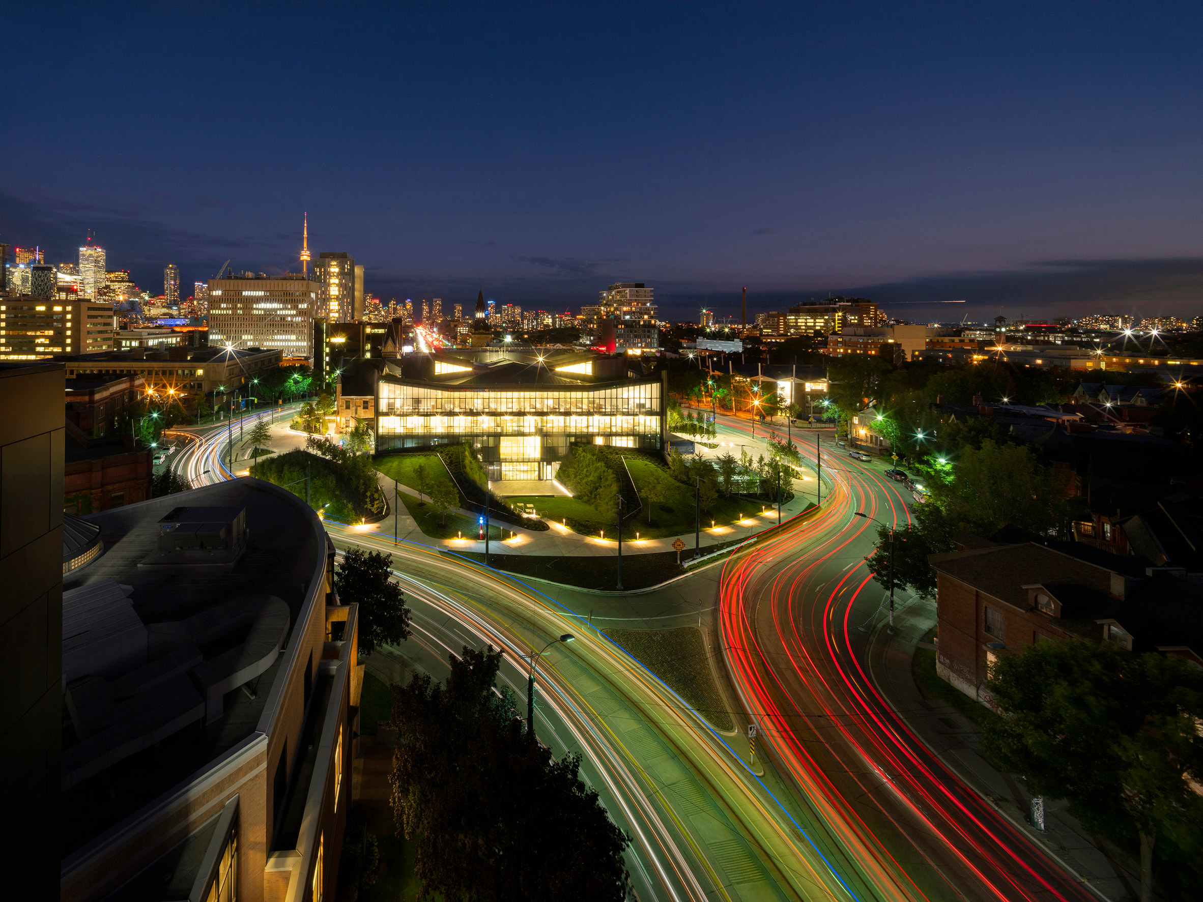
Officially called Daniels Building at One Spadina Crescent, the school building is located on the university's campus in central Toronto.
The project entailed the renovation of a Neo-Gothic brick building and the creation of a contemporary addition. The building occupies a rare, circular parcel situated in the middle of Spadina Avenue, which runs north to south.
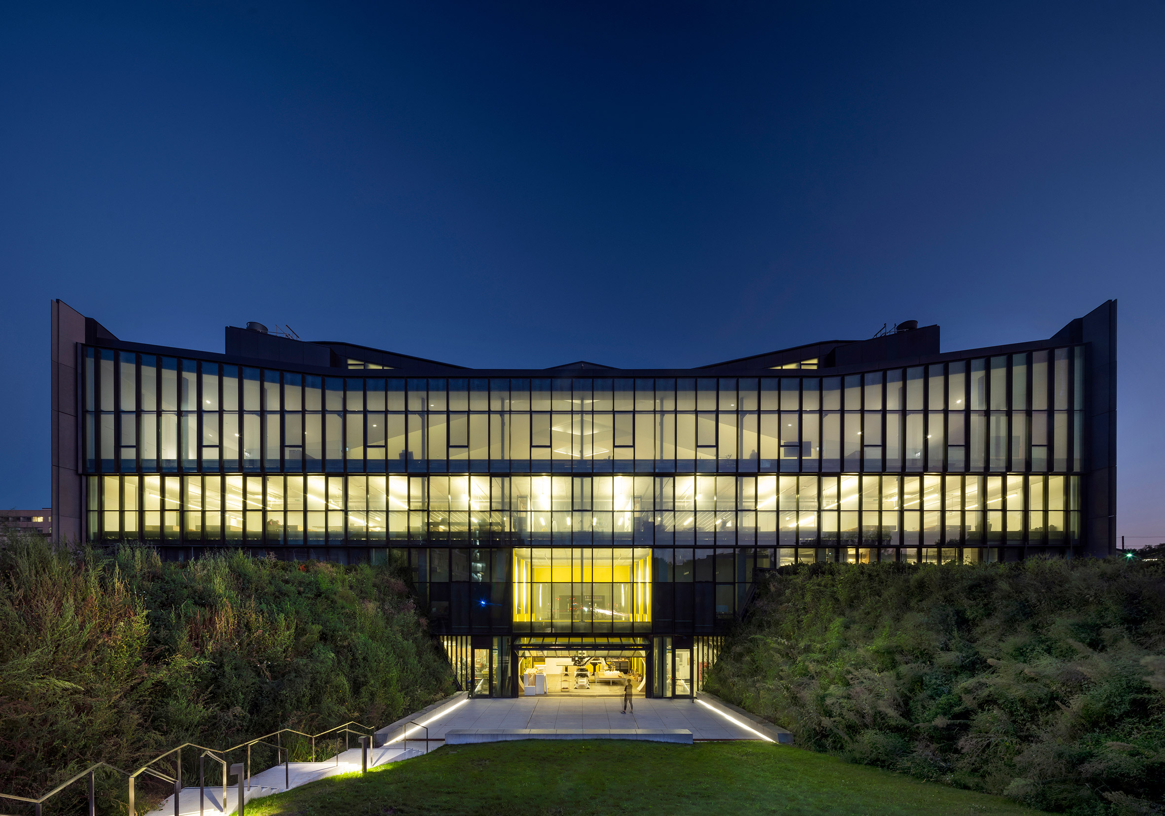
Encompassing 155,000 square feet (14,400 square metres), the expanded facility serves as the new home for the school's graduate programmes in architecture, landscape and design. Conceived by Boston studio NADAAA, the building is "inhabited and tested daily" by members of the architectural community, which upped the stakes for the design team.
"It is perhaps one of the few occasions where the audience is engaging with the building and its authors at a higher level, making it an added challenge – and responsibility – to speak to architectural questions with a greater degree of nuance," the team said.
"As such the building was designed to become a pedagogical tool, integrated into the curriculum with both sustainable design elements and school programmes on display, both to students and the public."
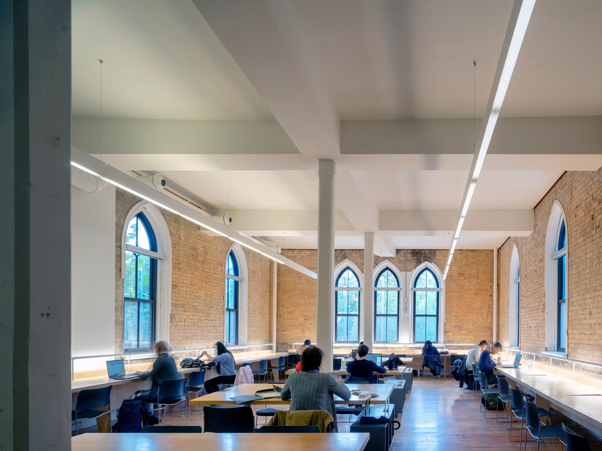
The historic building, referred to as Knox College, was designed by architects James Smith and John Gemmell, and dates back to 1875. It was originally built to serve as a Presbyterian seminary, and later became a military hospital and then a research lab for a pharmaceutical company, according to The Globe and Mail.
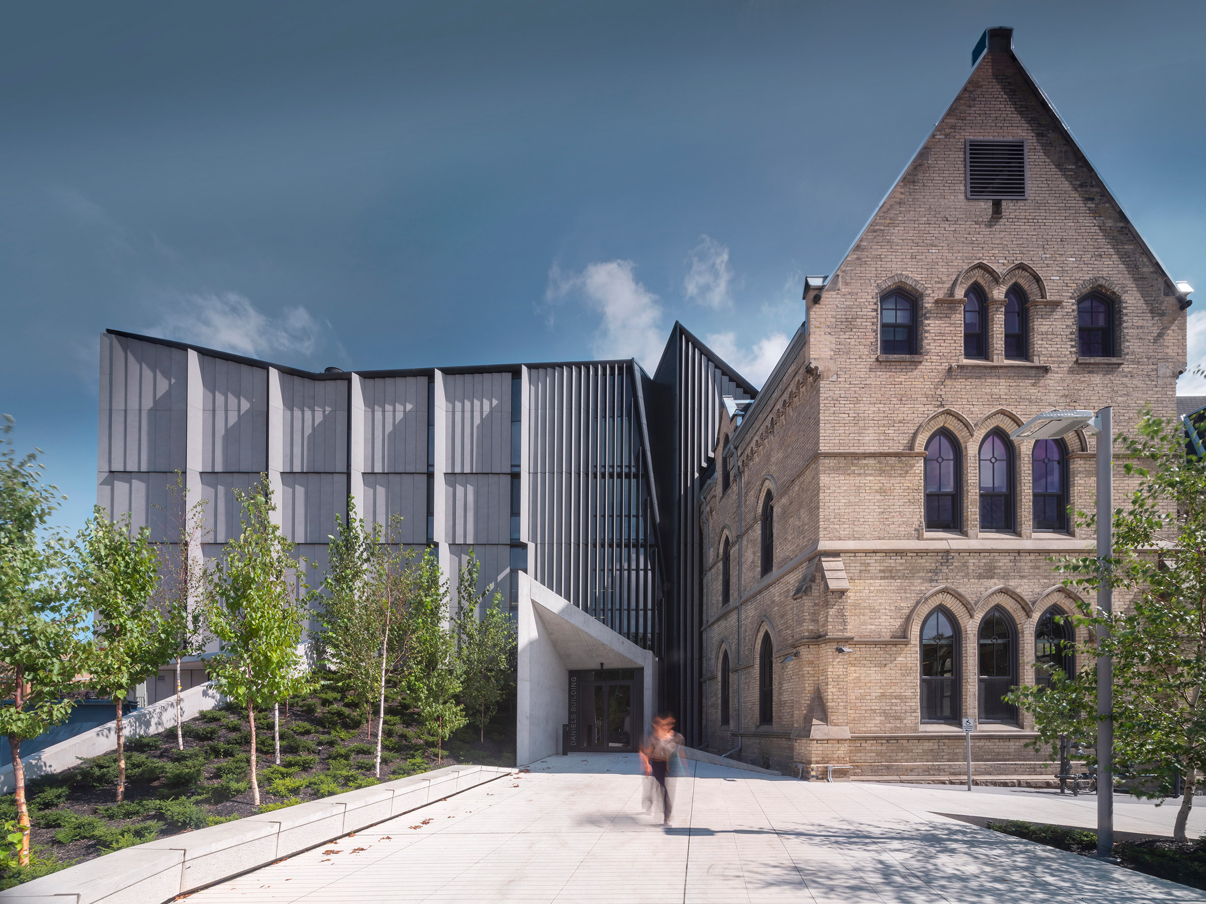
Acquired by the University of Toronto in the 1970s, the building has housed a hodgepodge of programmes and offices. Years ago, the university's design school – called the John H Daniels Faculty of Architecture, Landscape, and Design – set out to create its new home on the unique, urban site.
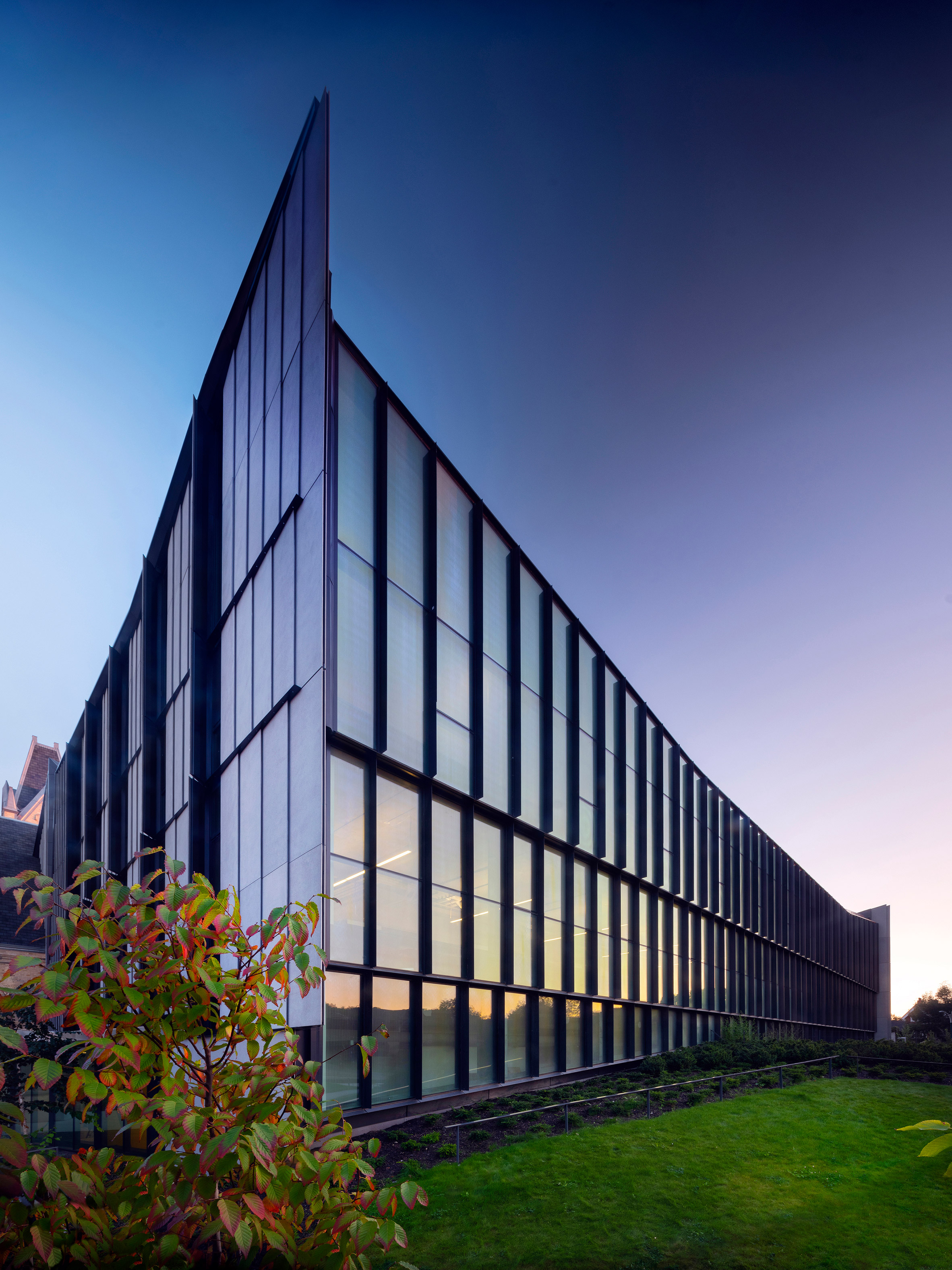
The historic building was largely kept intact, and its brick facades were refurbished. Adjoining the original structure is a sculptural mass made of metal, concrete and glass. The east and west sides are wrapped in folds of concrete, while the north-facing elevation features a black-framed curtain wall.
The main entrance to Knox College is located on the south, but with the expansion, the building now offers entrances on multiple sides. Along the west elevation, an arcade responds to the scale of the adjacent residential neighbourhood. On the east, a public plaza establishes a strong relationship with the campus.
"The renewed site invites activity, with circulation for pedestrians and cyclists," the team said.
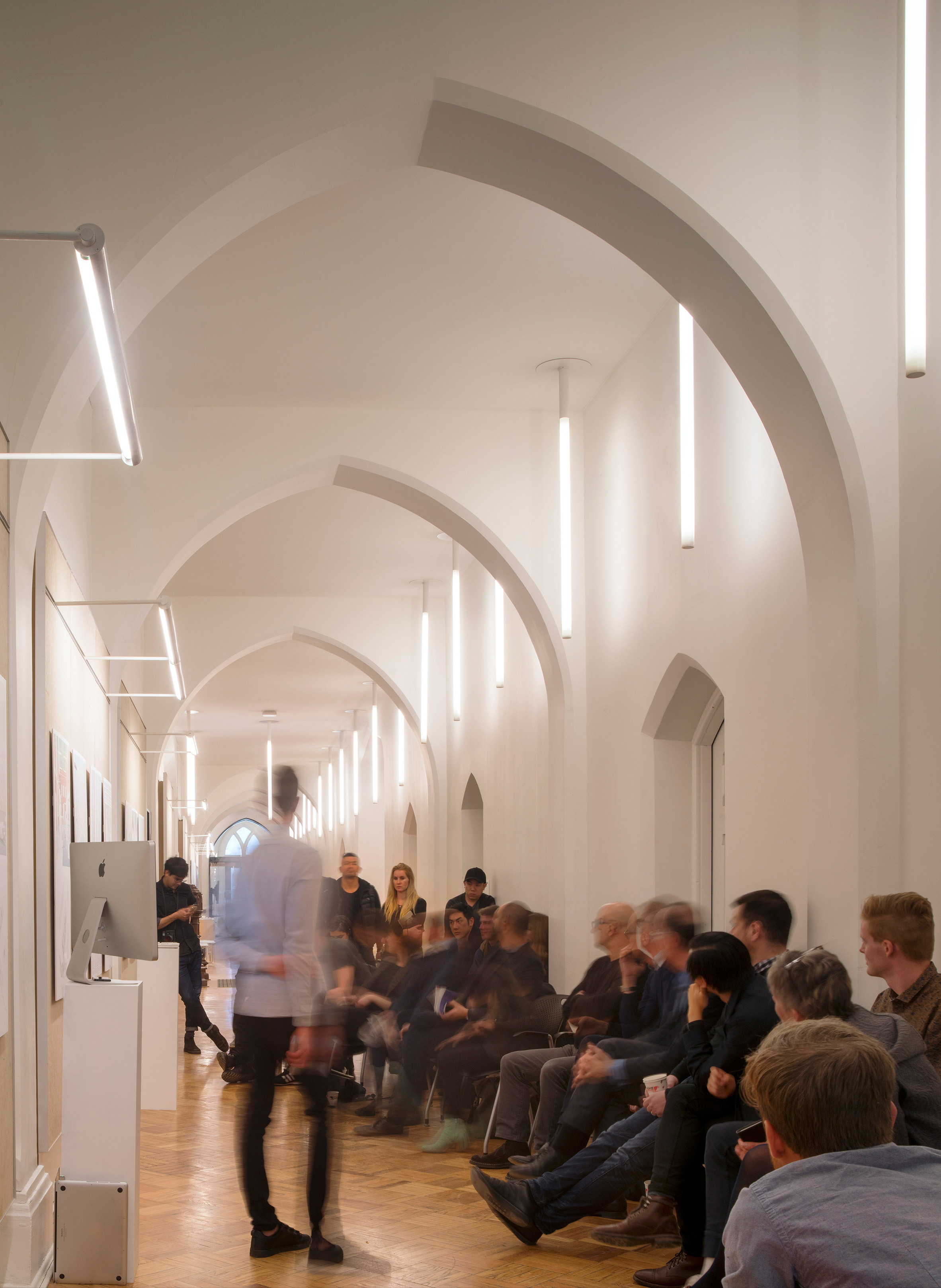
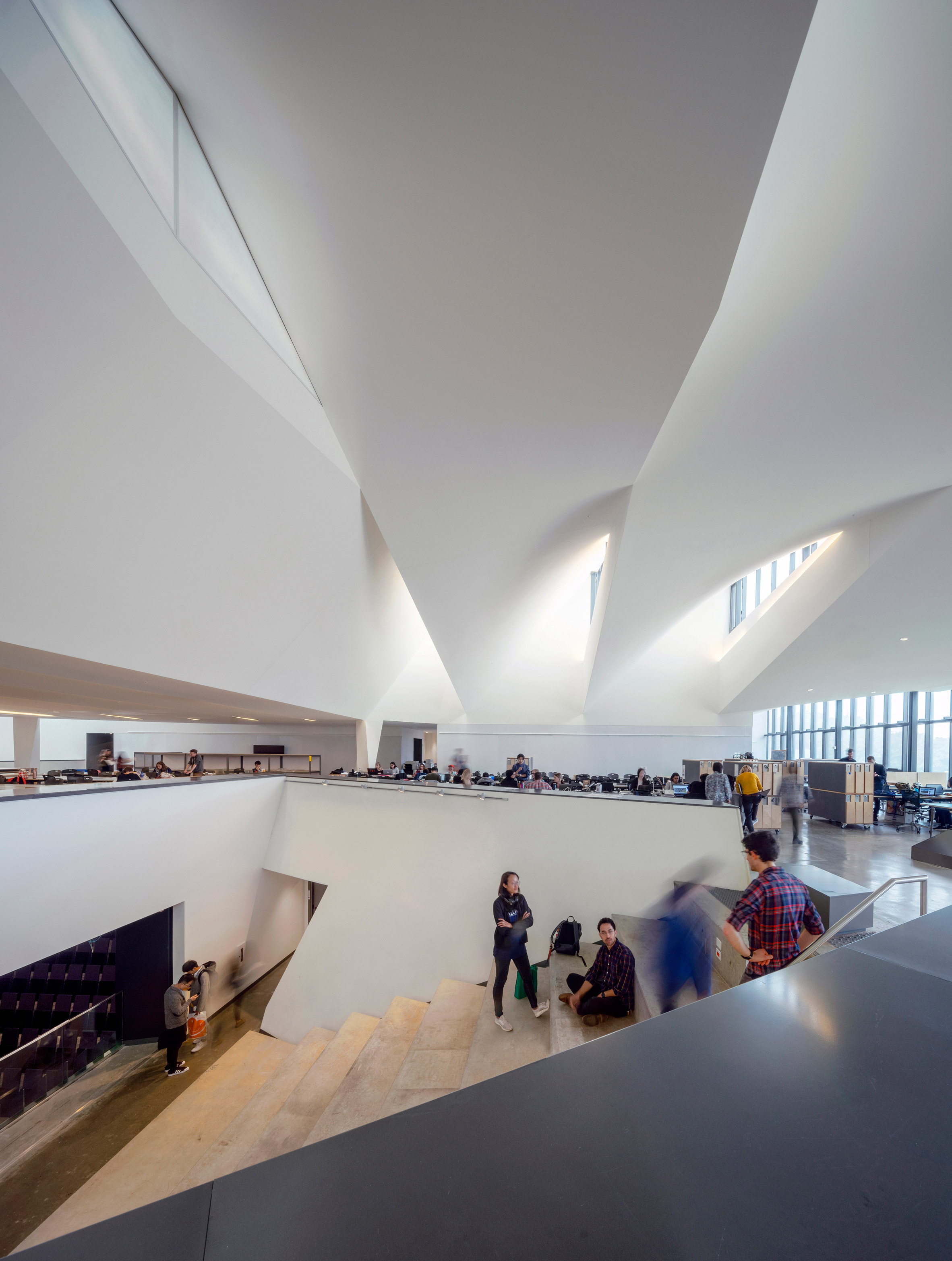
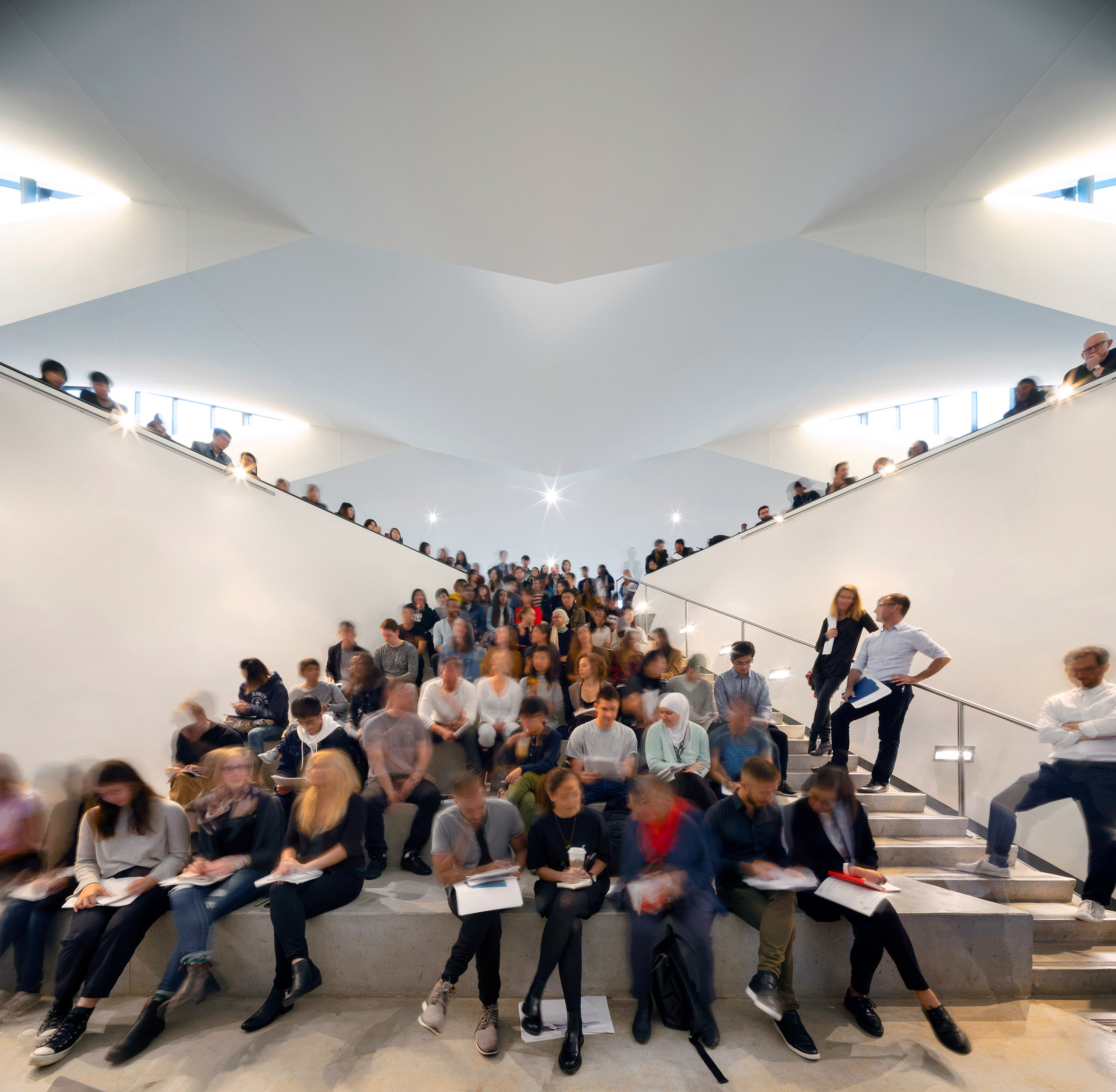
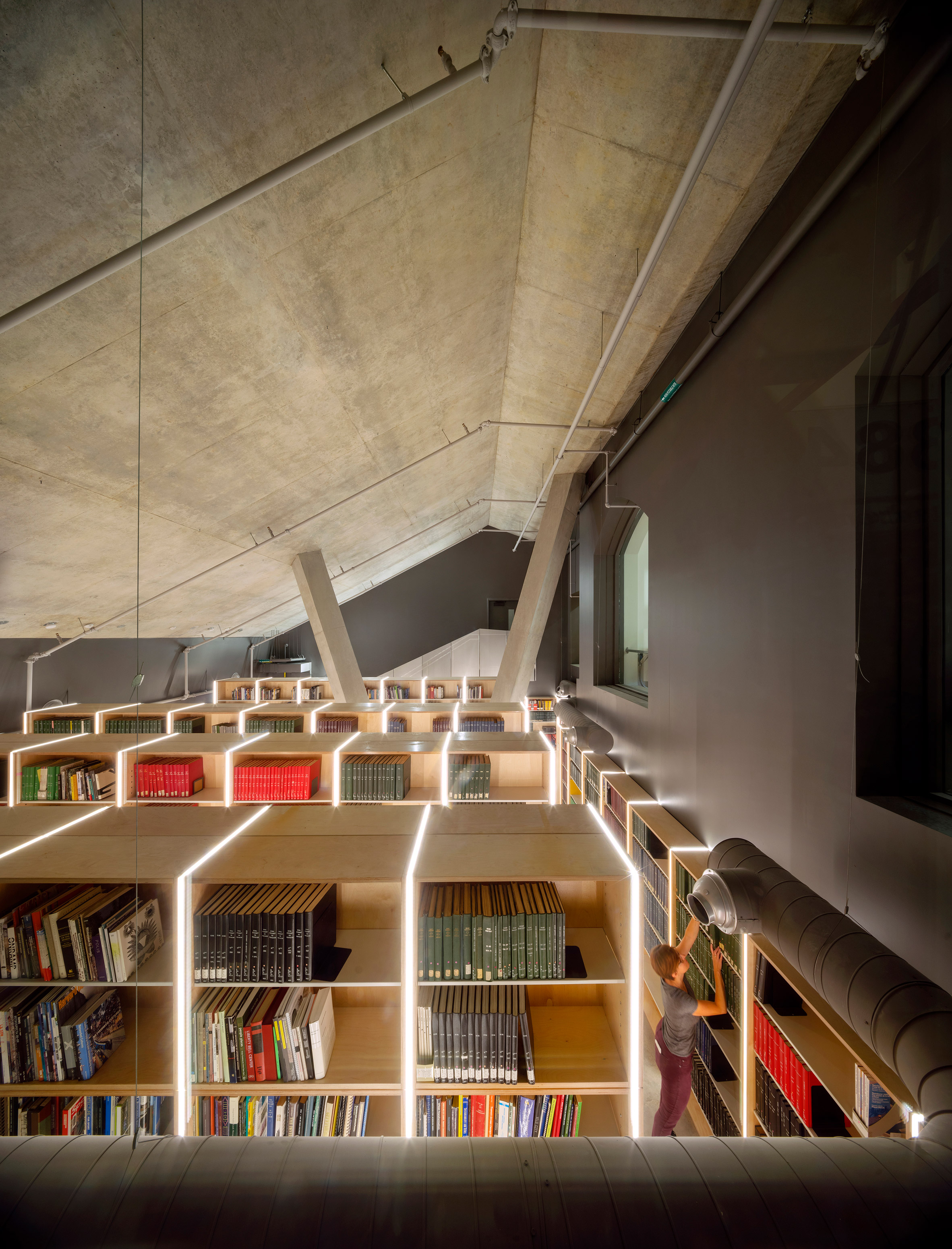
Inside, the building is divided into two distinct zones. The historic structure, which has a cellular layout, houses administrative functions, classrooms and a library. The new wing – which has a more irregular spatial composition – contains studios, labs and social areas.
Situated between them is a double-height hall with bleacher-style seating. Colourful slats of plywood adorn the walls and ceiling, adding a sense of energy and movement.
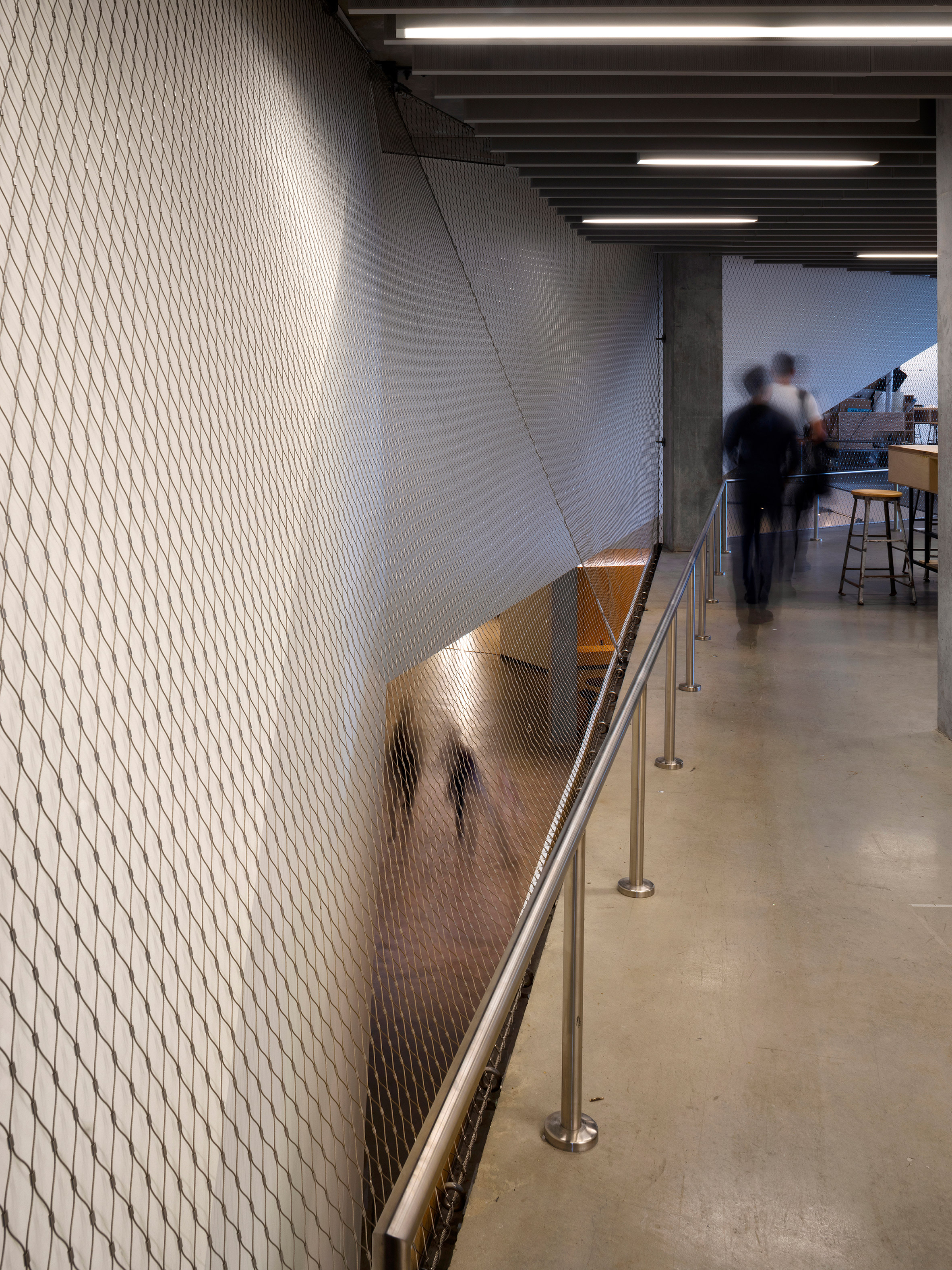
In the new wing, the team used a restrained palette of materials, including white walls, concrete flooring and mesh netting. Cutouts in the ceilings provide views between different areas of the building. Angles and curves give the interior a somewhat labyrinthine quality.

A centrepiece of the new volume is the third-level studio area – a column-free space that offers views of the cityscape through the north-facing curtainwall. Gypsum boards were used to form a dramatic ceiling with swoops and folds. Openings in the billowing ceiling allow clerestory light to flow into the studio.
The building is surrounded by native plants and trees such as birch and oak. On the site's north side, lush berms border a grassy slope and a stepped pathway that lead down to a subterranean fabrication laboratory.
The project has a number of sustainable features, including a stormwater management system and a green roof. There are plans to add rooftop photovoltaics in the future. The AIA recently awarded the project a COTE Award, which recognises buildings for sustainable design excellence.
Established in 2011, NADAAA is led by Nader Tehrani and Katherine Faulkner. Other projects by the studio include the drastic revamp of a 1920s Washington DC residence, and Aesop stores in San Francisco and the Hamptons.
Photography is by Nic Lehoux.
Project credits:
Lead architect: NADAAA
NADAAA team: Katherine Faulkner, Nader Tehrani (principals); Richard Lee, Tom Beresford (project managers), John Houser, Amin Tadj, Tim Wong, Alda Black, Marta Guerra, James Juricevich, Parke Macdowell, Dane Asmussen, Laura Williams, Peter Sprowls, Noora Al Musallam, Tammy Teng, Wesley Hiatt, John Mars, Mazyar Kahali, Matthew Waxman, Luisel Zayas
Architect of record: Adamson Associates Architects
Adamson team: Claudina Sula (principal); Jack Cusimano, Tina Leong, John McMillan, Martin Dolan, Zbigniew Jurkiewicz, Michael Lukachko, Zale Spodek, Gilles Leger, George Georges, Ke Leng Tran
Heritage consultant: ERA Architects
Structural engineering: Entuitive Corporation
Building envelope consultant: Entuitive Corporation
Mechanical, plumbing: The Mitchell Partnership
Acoustics: Aercoustics Engineering Ltd
Civil engineering: AM Candaras Associates, Inc
Landscape: Public Work
Construction manager: Eastern Construction Company Ltd
Select furniture design and construction: Daniels Faculty
The post NADAAA fuses old and new to create Daniels Building on circular Toronto site appeared first on Dezeen.
http://bit.ly/2Jqgqkj
twitter.com/3novicesindia
No comments:
Post a Comment