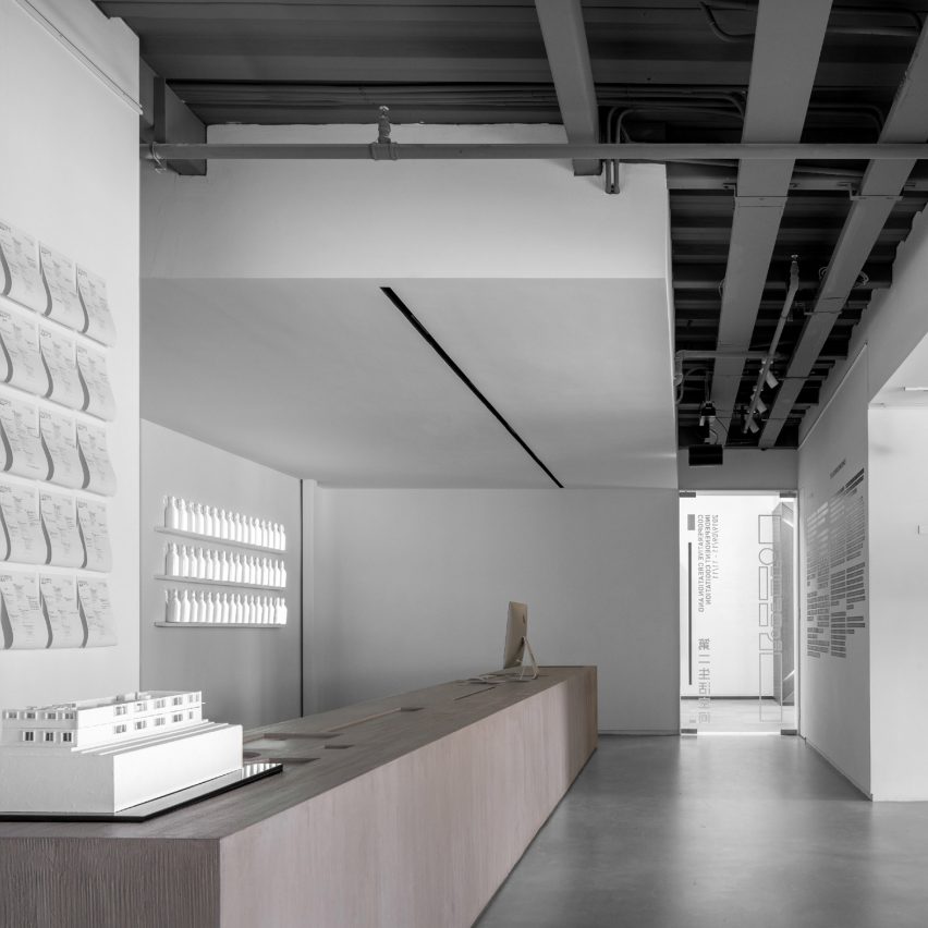
KCC Design has completed the interior design for its own office in Shanghai, which features an exhibition space and 21 enclosed boxes for individual work in a subdued colour palette.
The studio, which works in architecture and interior design as well as wayfinding, regional planning and lighting design, created the office in an old factory building that has been converted into office space.
KCC Design designed its new office, which has been shortlisted for the Dezeen Awards 2020 in the large workspace interior category, to make a move away from open-plan working.
"The most important thing is that we have been working in an open office working environment so far," KCC Design principal and design director Marco De La Torre told Dezeen.
"We thought it is problematic because more and more people no longer want this kind of working environment but a living environment," he added.
"After all, as a design company, we spend a longer time at the office, so we need to re-think how an office should be."
Though the studio was working from home in February due to the coronavirus pandemic, life in Shanghai returned to a sense of normalcy after March, De La Torre said, enabling it to come back to the office.
"We are wearing masks for public transportation and public venues like cinemas, all other activities have returned to normality," De La Torre said.
The studio discussed how to combine ideas of "individual and independent thinking" with "collective and cooperation creating" for the design of its office.
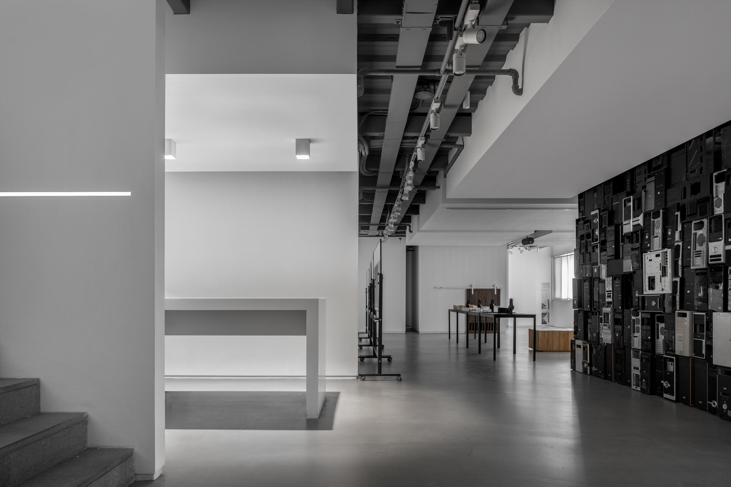
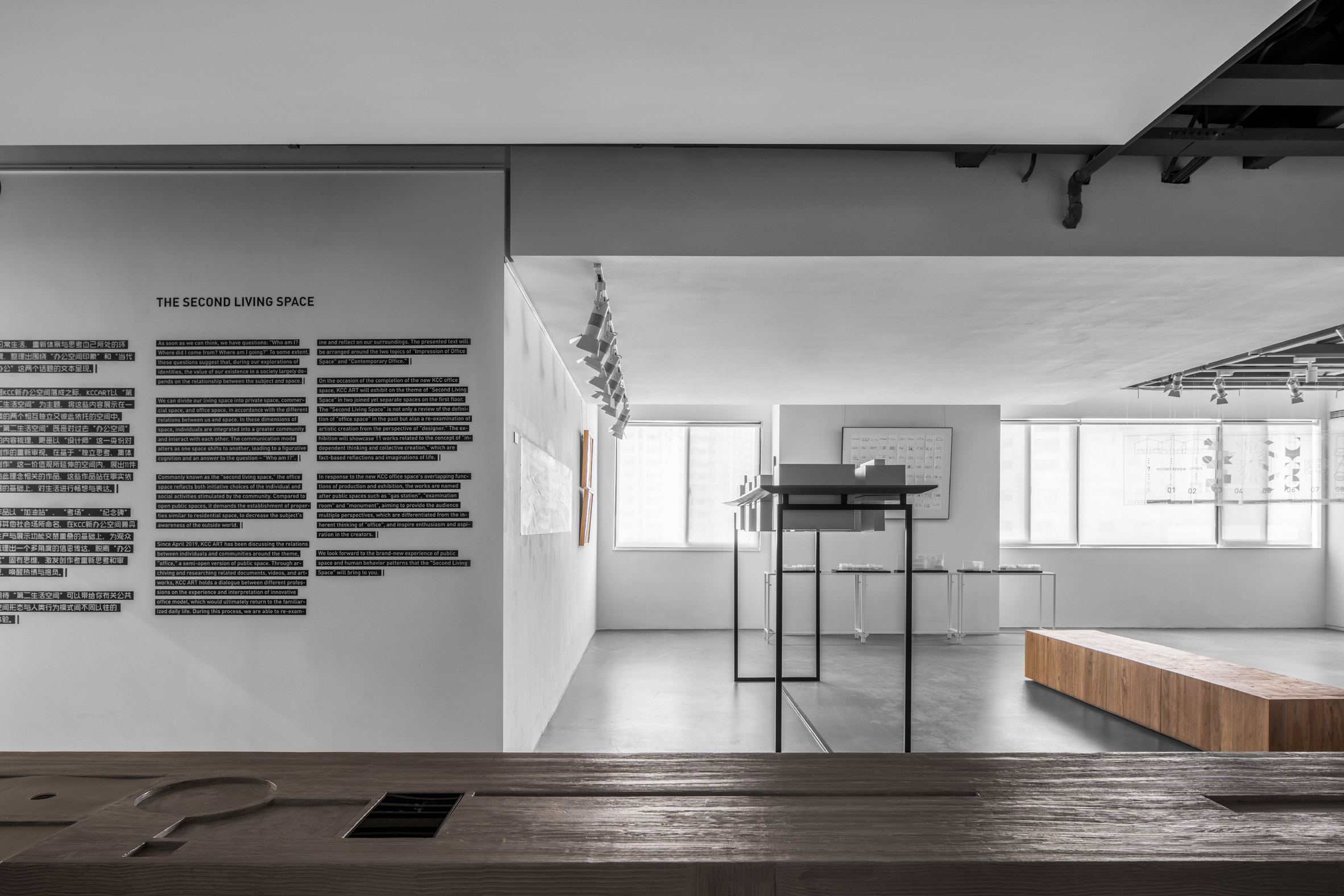
The solution was to divide the space into separate uses for separate floors. The ground floor of the office is the studio's public area, which it calls its "living space".
This floor has meeting rooms and tea rooms for client meetings, as well as an exhibition space that can also host events.
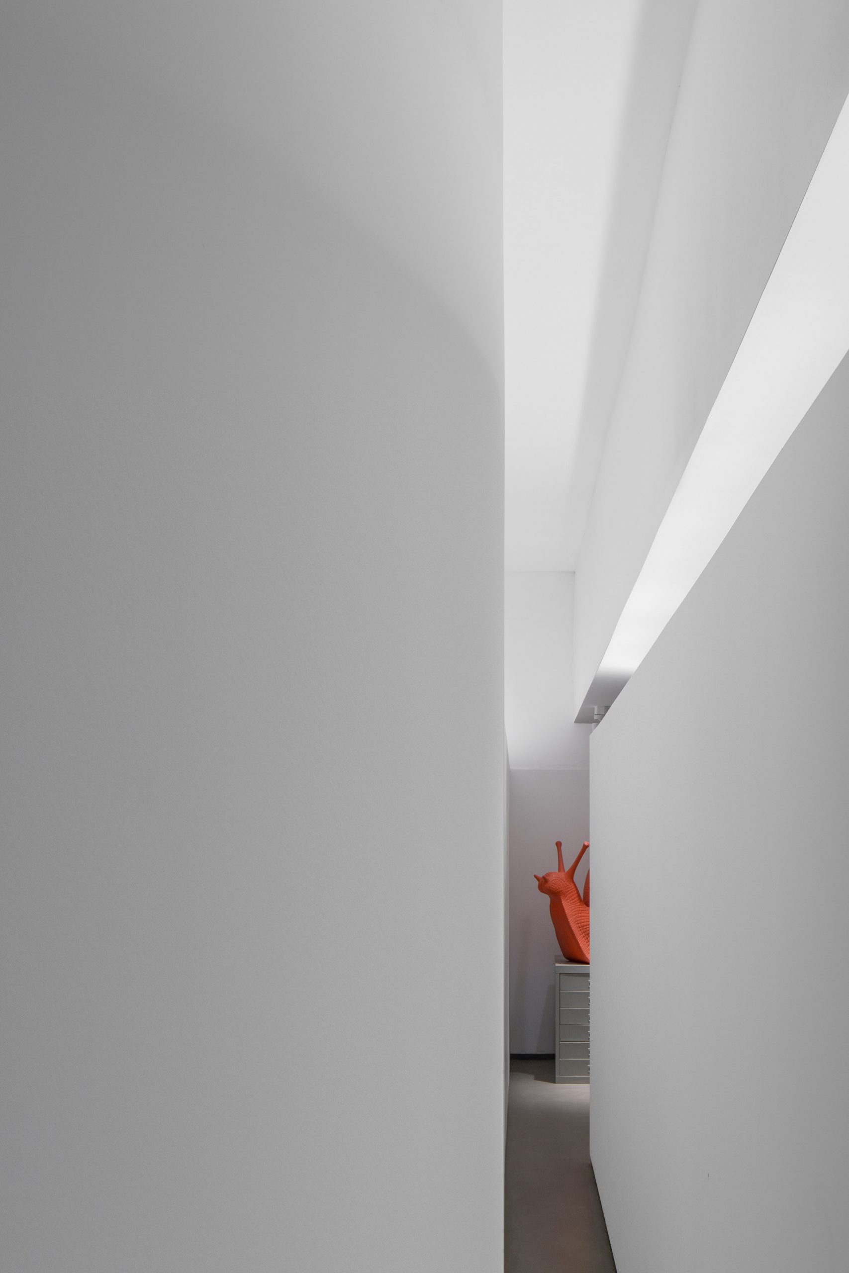
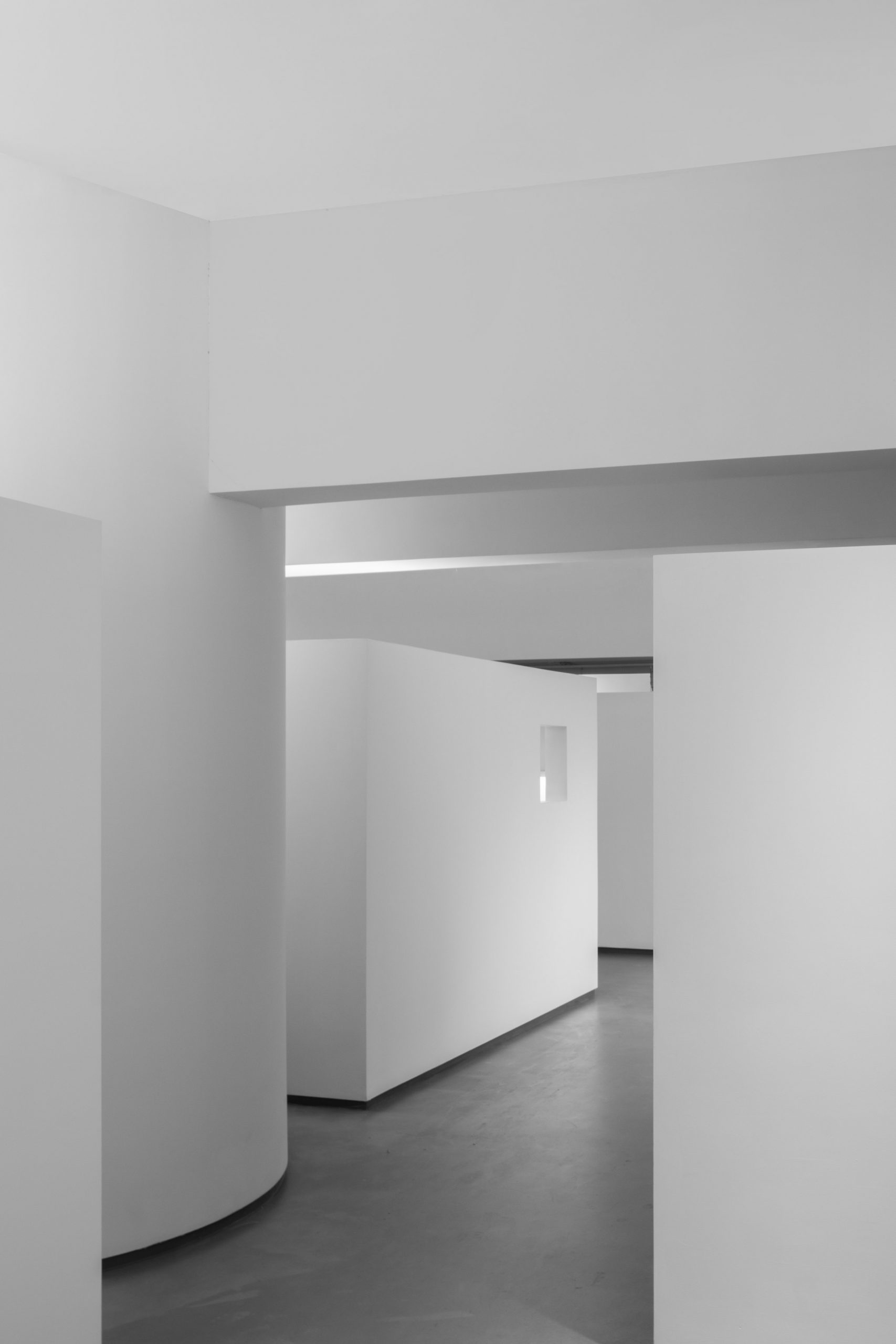
Upstairs on the first floor, the core office area has 21 enclosed boxes that are used as the studio's main workspaces. They are designed to function as private work areas where team members can also feel at home.
"This office design is for the people to feel 'living' here, not only as work display," De La Torre said.
KCC Design worked with a limited material and colour palette when designing the space. When it came to colour, the studio kept its office mainly white and grey, and said the reason behind its colour and material choices was simple.
"Concrete and paint are the only two materials," said De La Torre. "The reason for choosing such materials is their extreme plasticity. These inert materials also symbolise human wisdom and technology."
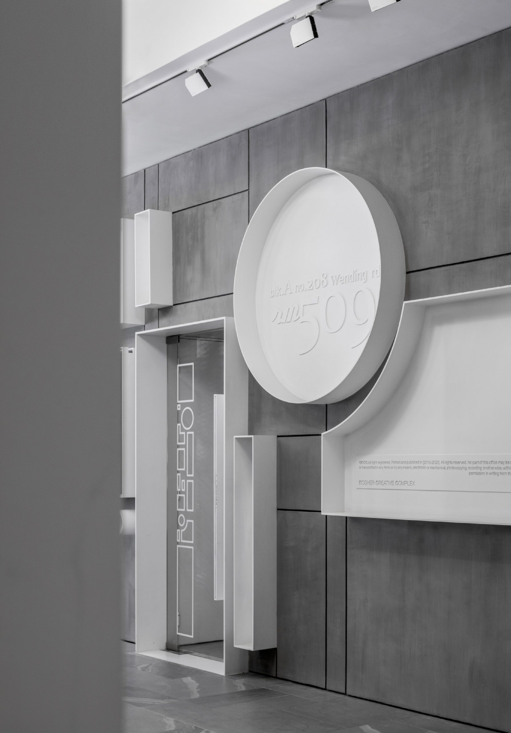
"They have no personality," De La Torre explained. "As dead as an inorganic substance. This extreme quietness is what we need most in a noisy urban environment and an impetuous work environment."
"Of course, the white of the whole wall also has the meaning of white paper to the designer," he added. "It represents the birth can be anything."
Describing interior and architectural design as a poetic, logical system, De La Torre said artificial space should be respected as an artefact.
"Therefore, the space poetry of this office space is 'we living here instead of working here now'," he said. "And the logical principle of our interior is a 'fluid and continuous public space' and a 'solid and independent private space'."
Many former factory spaces and warehouses have been turned into offices, including an old nylon factory in Arnhem that is now a "cathedral-like office space and a heritage building in Mumbai.
The post KCC Design creates monochrome office for own studio in former factory space appeared first on Dezeen.
https://ift.tt/3jACyHd
twitter.com/3novicesindia
No comments:
Post a Comment