In this week's comments update, readers are debating a Zaha Hadid Architects skyscraper which will occupy the world's most-expensive site in Hong Kong, and sharing their views on other top stories.
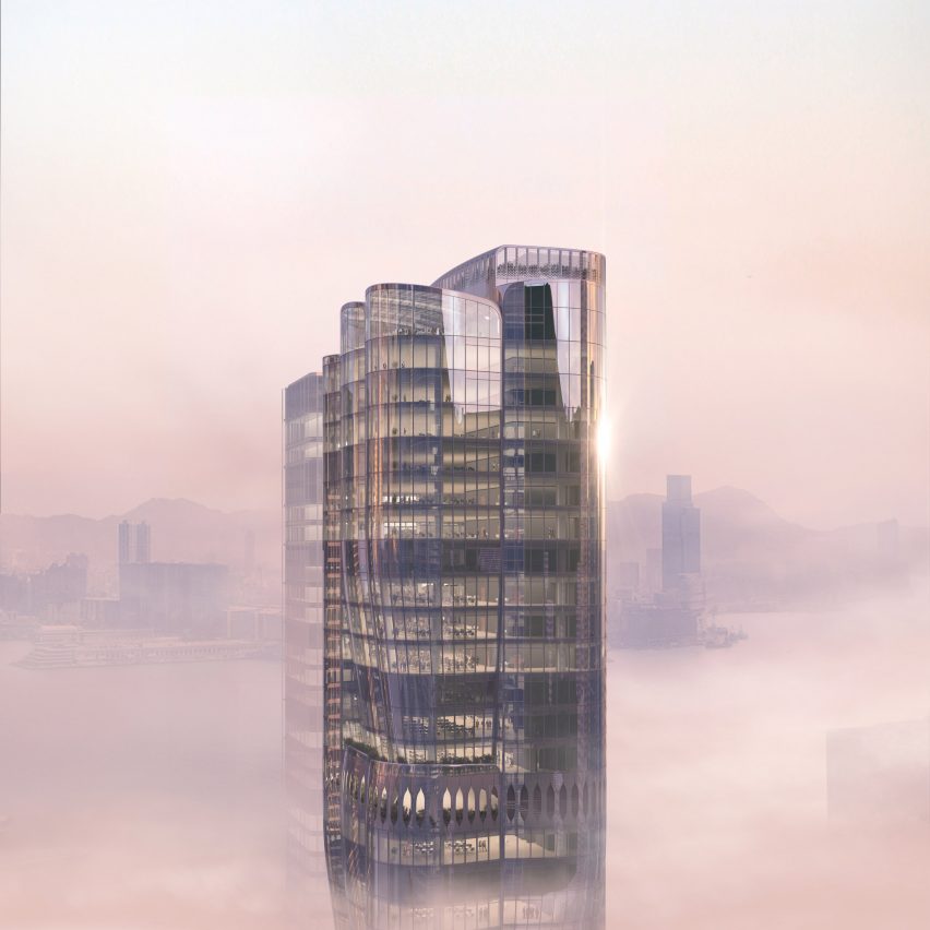
Zaha Hadid Architects has designed a 36-storey skyscraper in Hong Kong's central business district and the building's glass facade and sinuous design had readers reaching for their keyboards.
"A fresh take on space age design"
"Needs more trees and less shiny glass," advised Boreal.
Arch review felt similarly. "Still designing with all glass facades are we?" they asked. "Have we not heard the message of how terrible and inefficient this is?"
But the plant-inspired skyscraper did have its fans.
"Marvellous concept, definitely different yet still elegant and sublime," praised sacrecoeur.
"I associate the shapes with vintage space rockets which I see as a fresh take on space age design even if that wasn't intended by the designers," added Zea Newland.
Cameron Hood felt the building resembled items closer to home: "I usually like their designs, but this looks like a bunch of Dyson vacuum parts."
What do you think of the proposed building? Join the discussion ›

"It's tack-o-licious and I love it!" declares reader
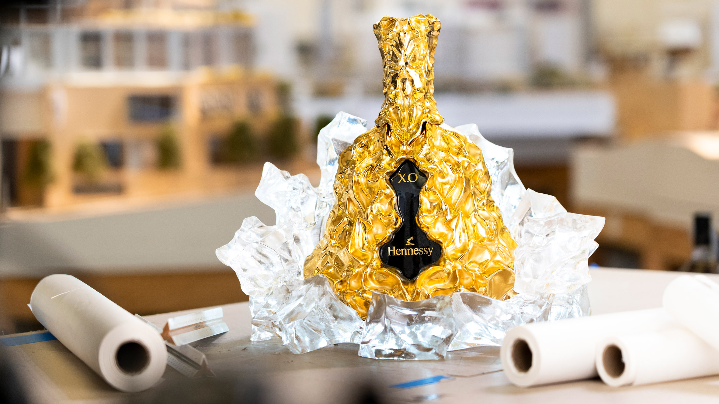
Pritzker Prize-winning architect Frank Gehry has designed a limited-edition, gold bottle for drinks brand Hennessy's X.O cognac. Gehry hopes the design is unlike "anything people have seen before" and commenters believe he has achieved his aim, although not everyone sees this as a good thing.
"24-carat gold plated bronze foil. Wow!" said Don Joe. "That is almost as classy as McDonald's celebrating its billionth Big Mac served by wrapping it in 24-carat gold plated styrofoam."
"Gehry's gone Gangsta!" agreed Dave. "This bottle of 'Henny' will surely appear in every rap music video – it's tack-o-licious and I love it!"
"I'm product seduced," declared Puzzello. "I absolutely want one."
Bassel disagreed: "Hennessy cognac and this bottle design are a perfect match, both are an affront to their respective category."
Are readers being unfairly critical? Join the discussion ›

"I'd move in there in a heartbeat" says commenter
A house in Portland with a cantilevered upper storey designed by Beebe Skidmore has impressed readers, but left them wanting more from the interiors.
"I'd move in there in a heartbeat, and usually I am not a detached house type of person," praised Leo.
"I quite like this," agreed Zea Newland. "The two cantilevers add some 'tension' to the exterior by making it look as if the top floor is being balanced on a scale."
"Exterior form is cool, interior is total blandsville," added Chris.
HOSTA felt similarly: "Well done on the exterior. Massing, palette, materials all spot on. Looks like you ran out of steam on the interior though."
Would you live in a house like this? Join the discussion ›

Reader declares sink "the most unusable ever created"
Szczepaniak Astridge has designed a house extension in London to centre around a "concrete sculpture" – an enclosed void that allows sounds and smells to travel around the house – but it's the kitchen sink that has grabbed readers' attention.
"Quite a lot of this is rather gorgeous," said WillR. "But that is simply the most unusable kitchen sink ever created, with no drainage board, and thus the need to carry wet things washed over the floor to a counter."
Apsco radiales also had practical concerns: "You notice how the taps don't have shut-off valves? To replace one bad or leaky washer you have the shut-off water to the whole house!"
"Flavors of Adjaye's earlier work for me," said JZ, on a more positive note. "Love the haptic qualities of spaces."
Are you a fan of Untitled House's concrete features? Join the discussion ›
Read more Dezeen comments
Dezeen is the world's most commented architecture and design magazine, receiving thousands of comments each month from readers. Keep up to date on the latest discussions on our comments page.
The post Zaha Hadid Architects' Hong Kong skyscraper is "a fresh take on space age design" says commenter appeared first on Dezeen.
https://ift.tt/36hBQej
twitter.com/3novicesindia
No comments:
Post a Comment