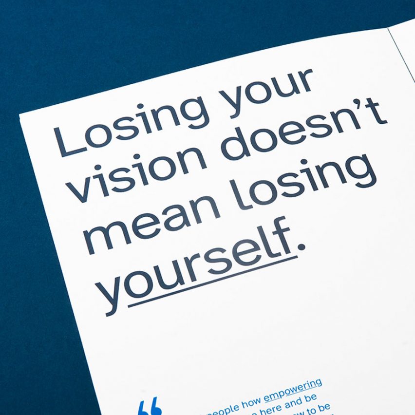
Graphic designer Applied Design Works has collaborated with the nonprofit organisation Braille Institute to develop a "hyperlegible typeface" for the visually impaired community.
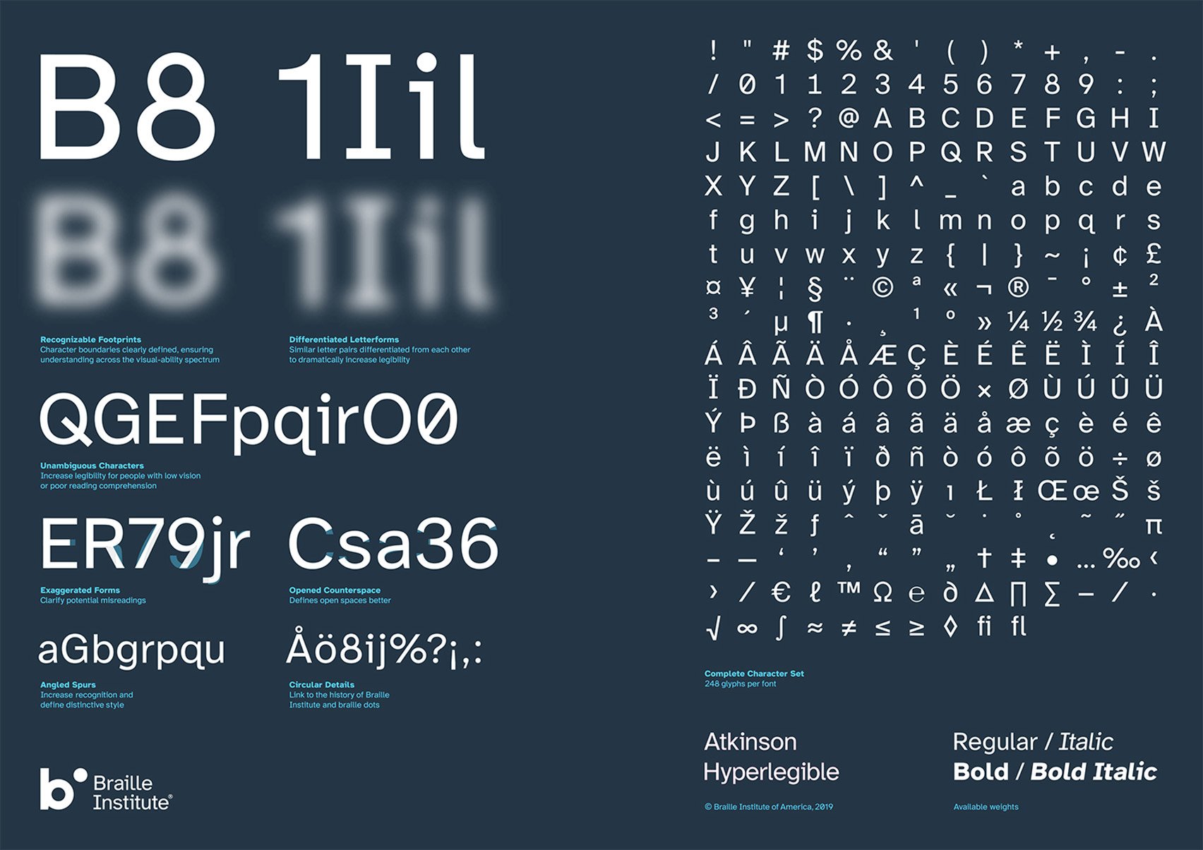
The font family, which is named Atkinson Hyperlegible after Braille Institute founder Robert Atkinson, is composed of distinct and exaggerated letterforms crafted by Applied Design Works to increase character recognition and the readability of written content.
It is free of use by anyone who wants to make their own written materials widely accessible and can also be used for signage or to help people with good vision read quickly and accurately.
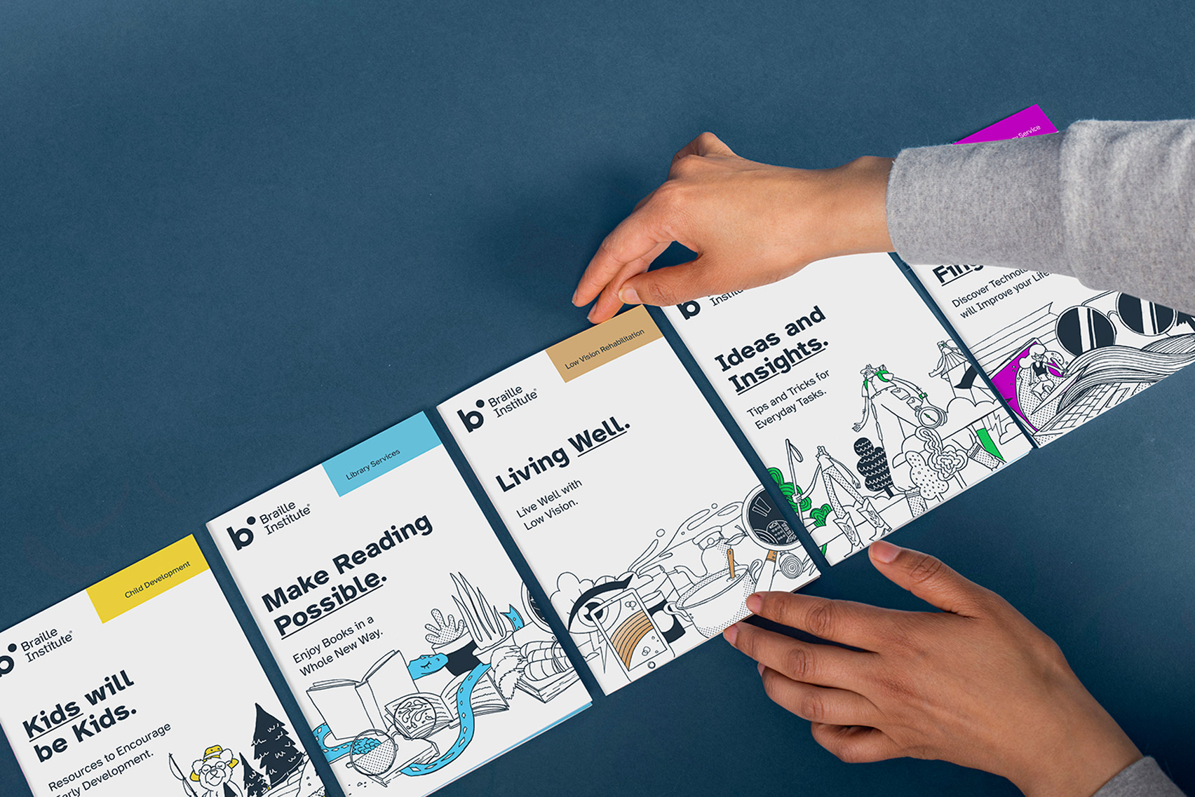
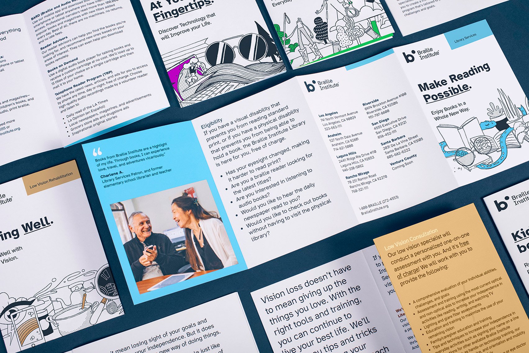
Atkinson Hyperlegible was developed by Applied Design Works while creating a new visual identity for the Braille Institute to reflect a growing number of people around the world with vision impairment and the organisation's efforts to serve this community.
However, during this process, Applied Design Works discovered that a typeface that mirrored this goal and met the needs of people with low vision did not exist.
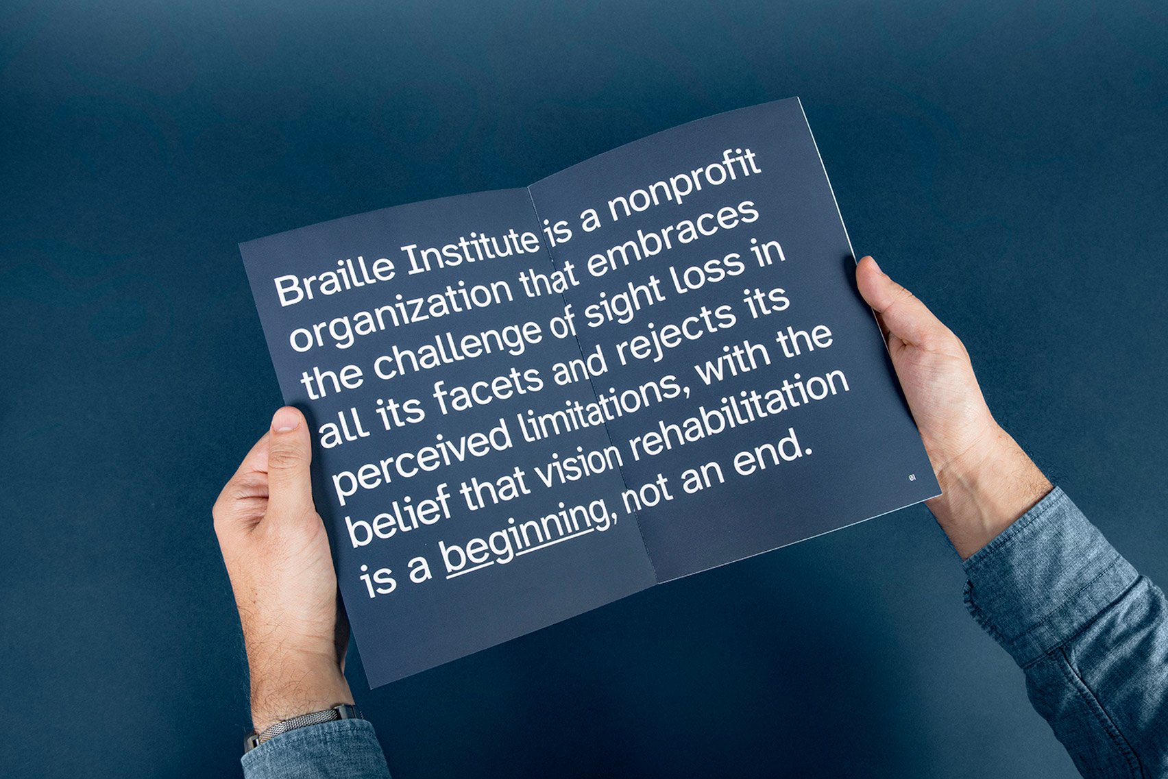
"There was no brief for the Atkinson Hyperlegible typeface, it was born simply out of a strong desire to improve the lives of people with low vision," explained Applied Design Works.
"The number of people who live with low vision is increasing at an incredible rate as people live longer and chronic conditions like diabetes that cause damage to people's eyes," the studio continued.
"The Braille Institute asked Applied Design Works to help them with a new positioning and visual identity to reflect a significant shift in the way the organisation helps people adapt to vision loss."
Atkinson Hyperlegible, which has since been shortlisted for the Dezeen Awards 2020 in the Graphic design category, is available in four font styles – regular, bold, italics, italics bold.
To ensure the readability of each font, they were developed in a collaboration with a low-vision specialist from the Braille Institute and a panel of people with visual impairments. The font family also has accent characters to support 27 languages.
Unconventionally, Atkinson Hyperlegible prioritises letterform distinction and clearly defined letter shapes over visual consistency and aesthetic appeal.
In this way, the typeface borrows elements from different font types and families that would not usually be teamed together.
"Atkinson Hyperlegible may prove to only the first of its kind in a newly imagined category of hyperlegible typefaces," the studio explained. "Typefaces that break with the longstanding tradition of letterform harmony and focus instead on letterform distinction to increase character recognition."
This is evident where the capital letter I has been characterised with serifs but the capital letter T has not. Serifs are the decorative stroke that finishes off the end of a letter stem and are typically consistent within a font family.
Similarly, some letters feature curved tails while others are straight – as seen when comparing the capital and lowercase Q.
Other key details that have been used to exaggerated shaping of letters include angled spurs, the part of a letter that extends from a curve.
Meanwhile, circular detailing on many of the letters is designed to evoke braille dots, as a nod to the history of Braille Institute.
Other new font families that feature on Dezeen include Body Type by Julius Raymund Advincula that is made from cleverly positioned body parts, the first digital typeface family for the Welsh language by Smörgåsbord and a typeface called Sans Forgetica that aims to aid memory.
The post Atkinson Hyperlegible typeface is designed for visually impaired readers appeared first on Dezeen.
https://ift.tt/2RgTlCM
twitter.com/3novicesindia
No comments:
Post a Comment