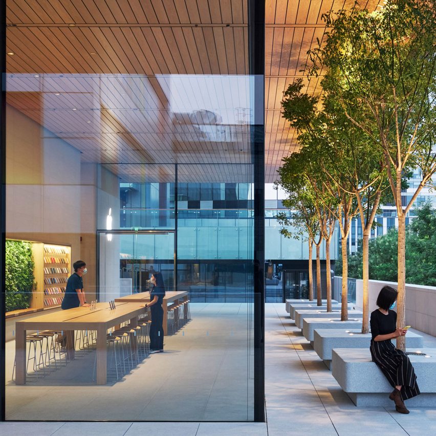
A large overhanging roof shelters the expansive glass walls that front the "open and inviting" Apple Sanlitun store by Foster + Partners in Beijing, China.
Located in a large open square within Sanlitun, an area of the capital city's Chaoyang District, the building replaces China's first Apple Store built adjacent to the site in 2008.
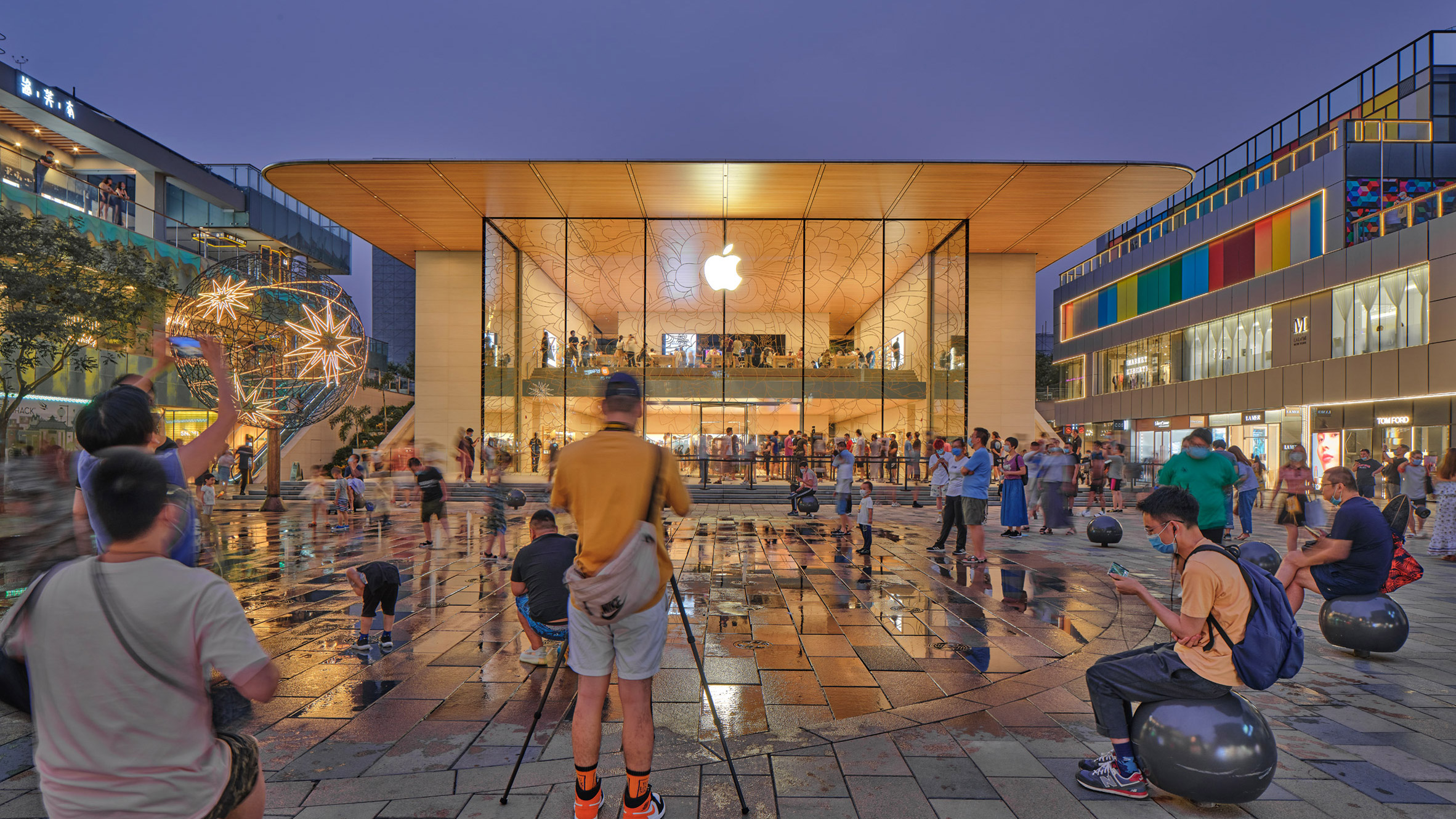
Apple Sanlitun was developed by Foster + Partners in collaboration with Apple. It is twice the size of the original store and positioned on a more prominent site within the plaza.
It was designed with a "porous building envelope" that is accessible on all four sides and distinguished by a storefront with 10-metre-high glass panels to minimise the boundary between the inside and outside.
"Apple Sanlitun is all about being open and inviting – visually, physically and metaphorically," said Stefan Behling, head of studio at Foster + Partners.
"The store is a grand place that connects the inside and the outside," he explained.
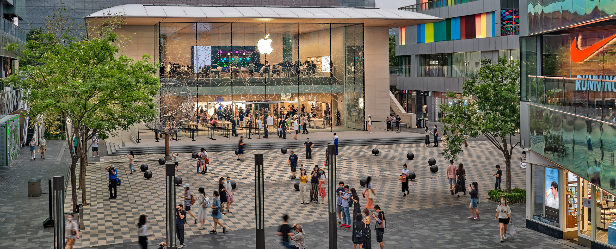
Apple Sanlitun's principal glass facade is adorned with floral motifs and connected to large stone walls that wrap around the rest of the building.
Glazed areas lined with trees were also built at the rear of the store, which were intended to reflect those in the plaza and help "dematerialise the boundary between the inside and the outside" further.
Overhanging the glazed areas is a large flat roof, designed by Foster + Partners to shelter customers from the hot summer sun and heavy rain while maintaining uninterrupted views of the plaza and natural lighting inside.
This roof was lined with timber on its underside – similarly to the studio's Apple Michigan Avenue and Apple Iconsiam – and incorporates 390-square-metres of photovoltaic panels on top to help offset the store's energy consumption.
Inside, Apple Sanlitun's interiors are vast and uninterrupted, comprising a ground floor and a cantilevered upper level that steps down to a viewing deck.
This open layout was achieved by a structural system named Special Truss Moment Frame that was designed to resist seismic forces while allowing large column-free interior spaces. According to Foster + Partners, it is the first time the system has been utilised in Chinese architecture.
At ground level, there are 15 product tables and display cases positioned along the walls, alongside a private boardroom for business customers that are concealed through frosted glass.
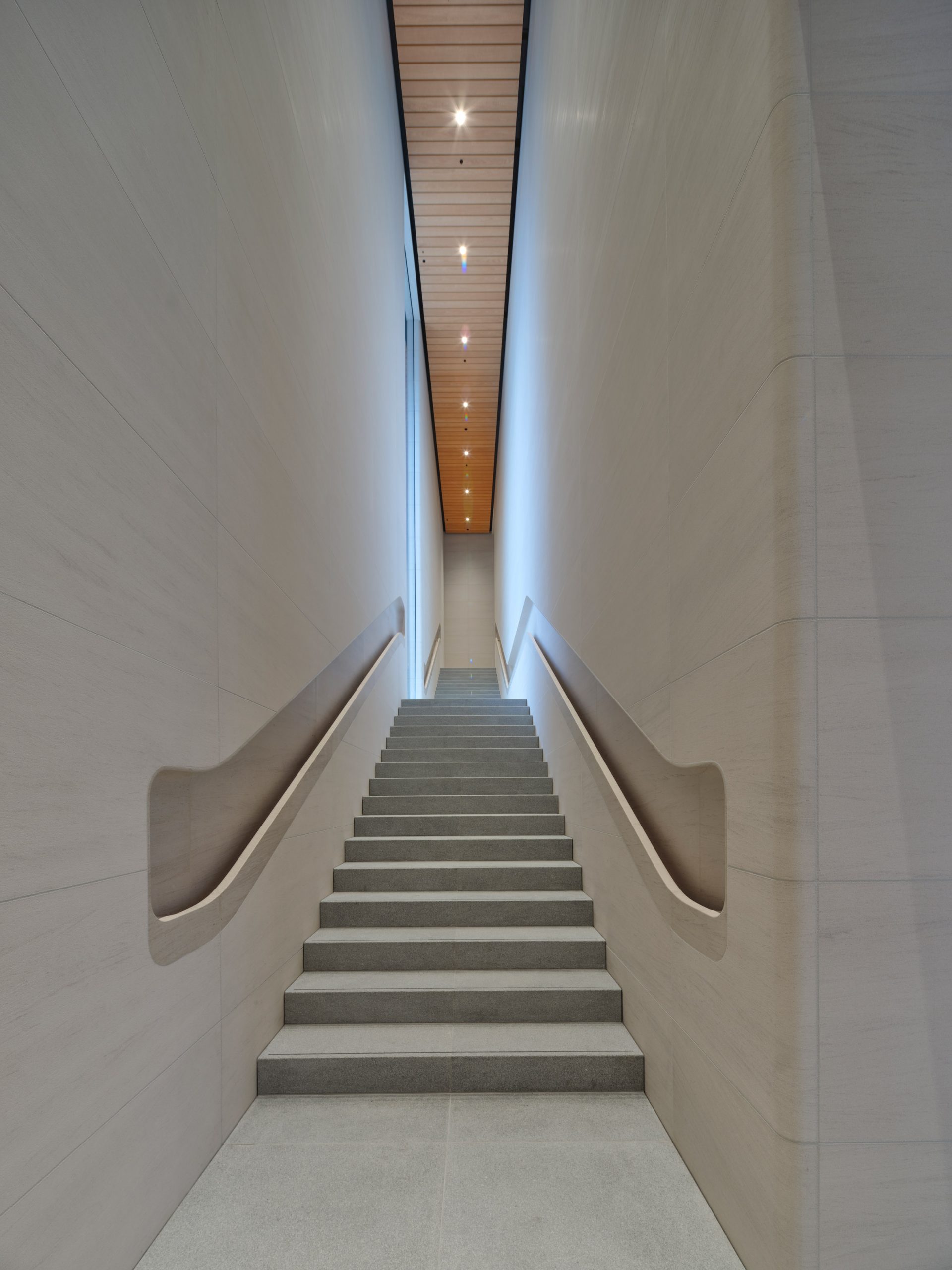
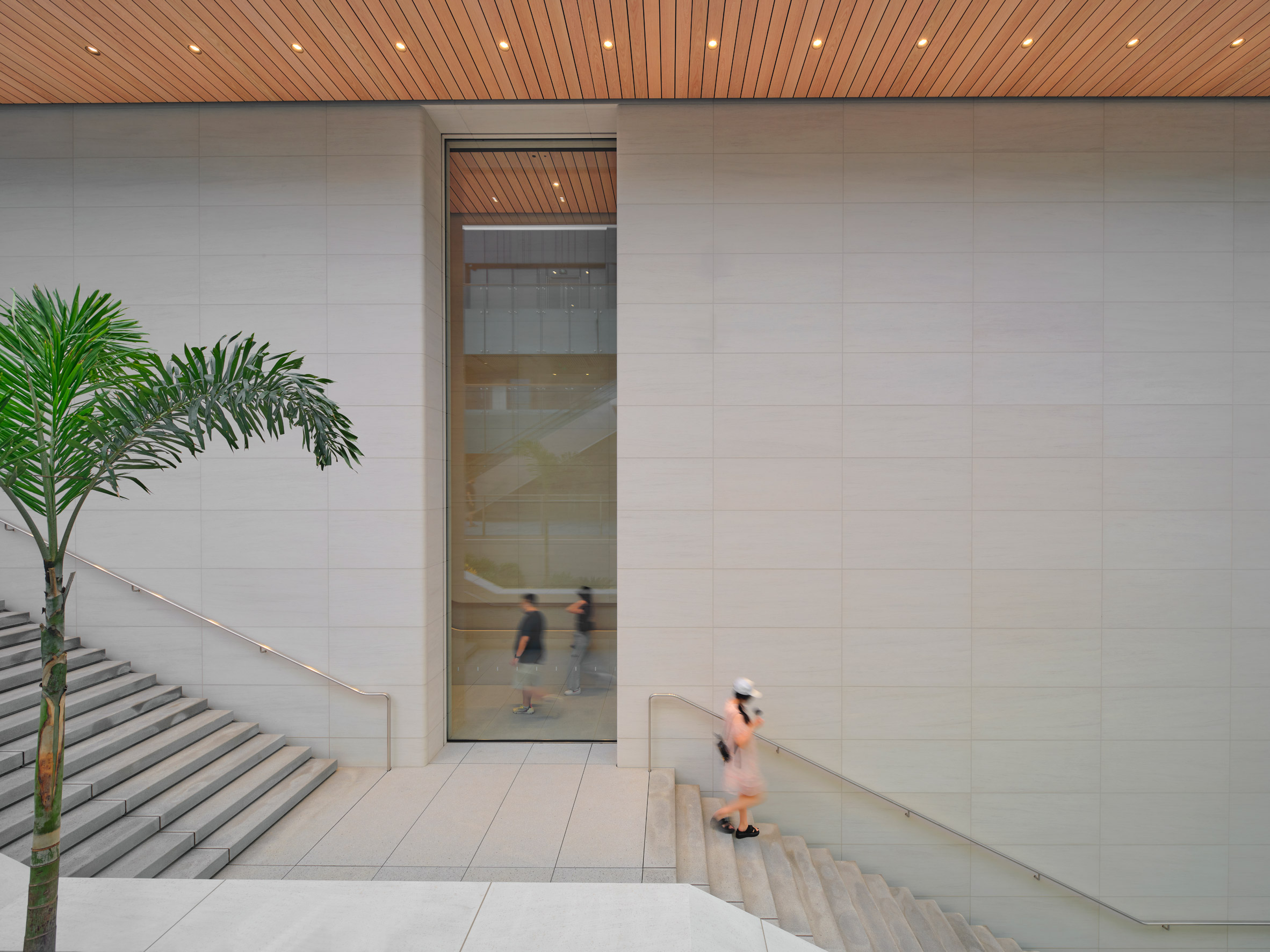
At the rear, two large stone staircases were positioned on either side to guide visitors upstairs, which are both mirrored externally with staircases in the plaza.
The store's Genius Grove, where visitors can receive customer support and help with their devices, was placed upstairs alongside The Forum.
The Forum, which will host Today at Apple sessions with artists and creatives from Beijing, steps down to the panoramic viewing deck that is filled with upholstered leather seating.
Foster and Partners is an international architecture studio with headquarters in London, founded in 1967 by Norman Foster. The studio is behind the design of all the latest Apple Stores, including Apple Piazza Liberty in Italy and Apple Champs-Élysées that were completed in 2018.
Other recent projects by the studio include Dolunay Villa in Turkey, a luxury residential tower in London and an online book to entertain children during the coronavirus pandemic that stars its Gherkin skyscraper.
Photography is by Chaoying Yang unless stated.
The post Foster + Partners designs "porous" Apple store in Beijing appeared first on Dezeen.
https://ift.tt/2PmXvYH
twitter.com/3novicesindia
No comments:
Post a Comment