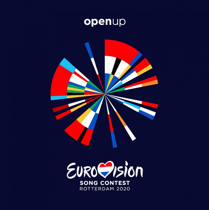
Design agency Clever Franke has created a logo for the Eurovision Song Contest 2020 that combines the flag and year that each of the 41 participating countries first competed.
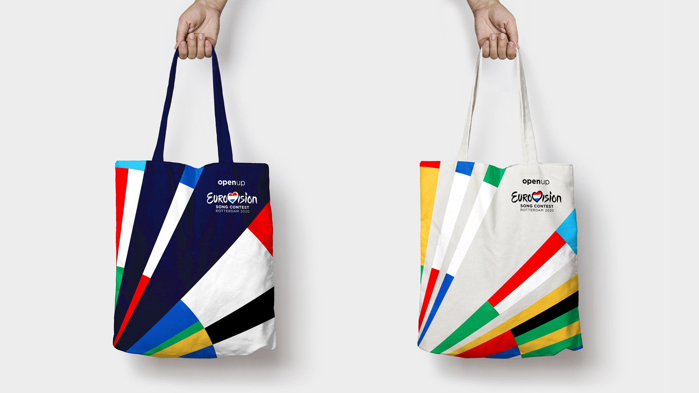
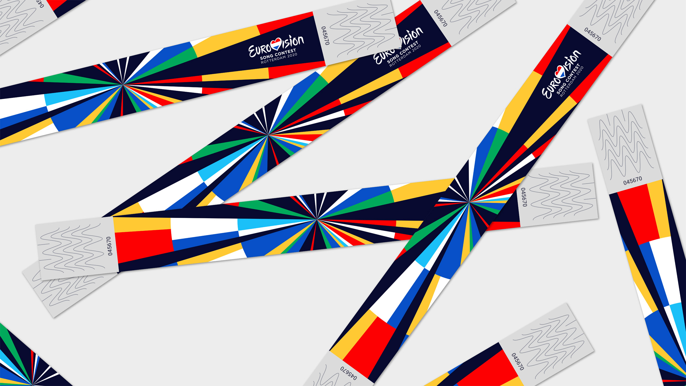
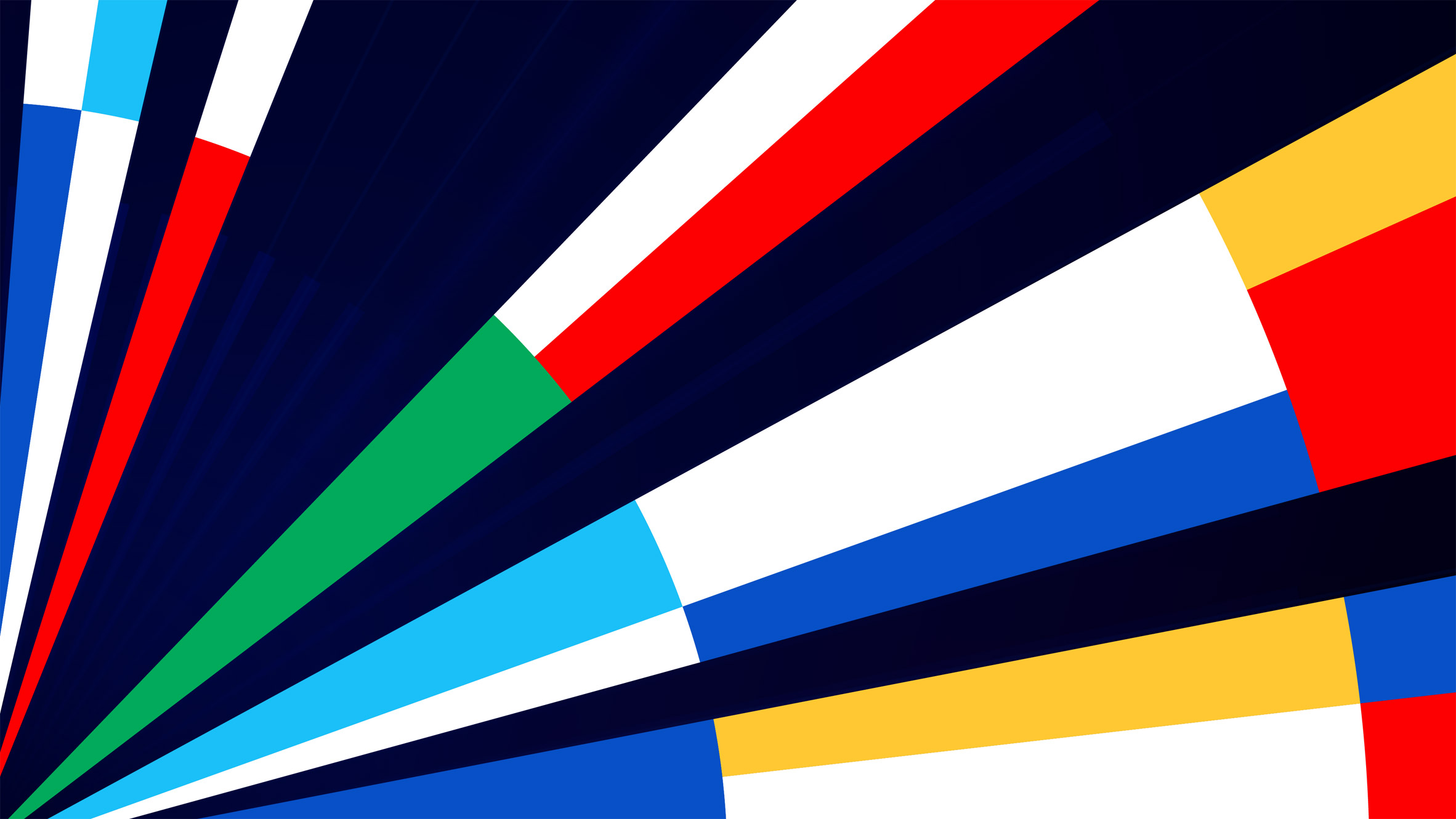
The logo comprises a series of brightly coloured vectors emanating from the central point of a circle, like a sunburst.
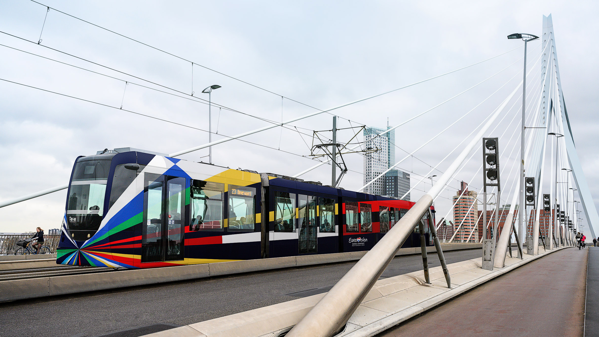
It will be used during the televised Eurovision Song Contest 2020 event, which takes place in Rotterdam next year, as well as in advertising and on merchandise.
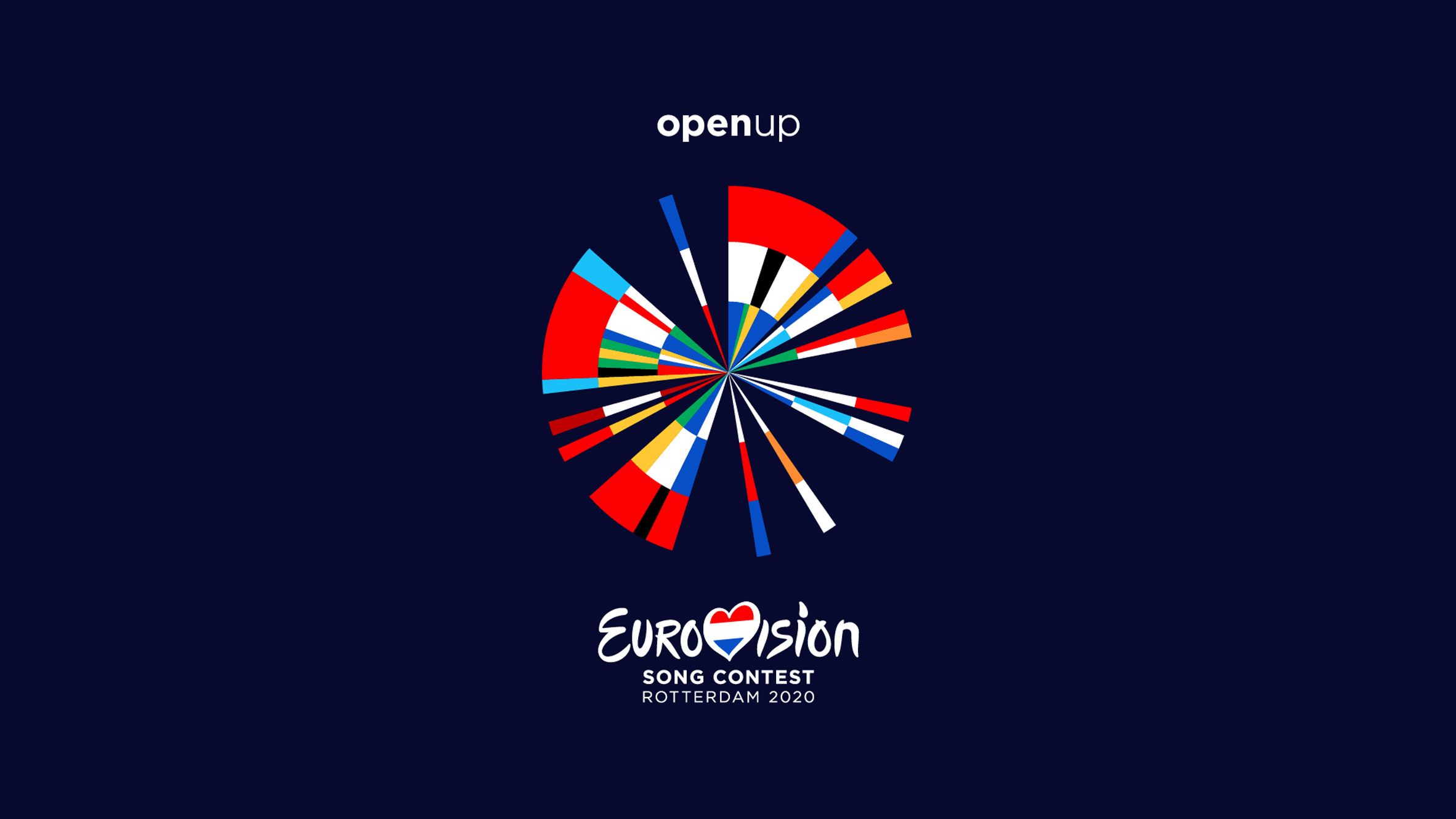
The design is a visual representation of the flags of all 41 countries that are participating in Eurovision in 2020.
Clever Franke took the colours of each country's flag, and used Processing and Illustrator software to add them clockwise in chronological order of first entry to the competition, to create a colourful abstract symbol.
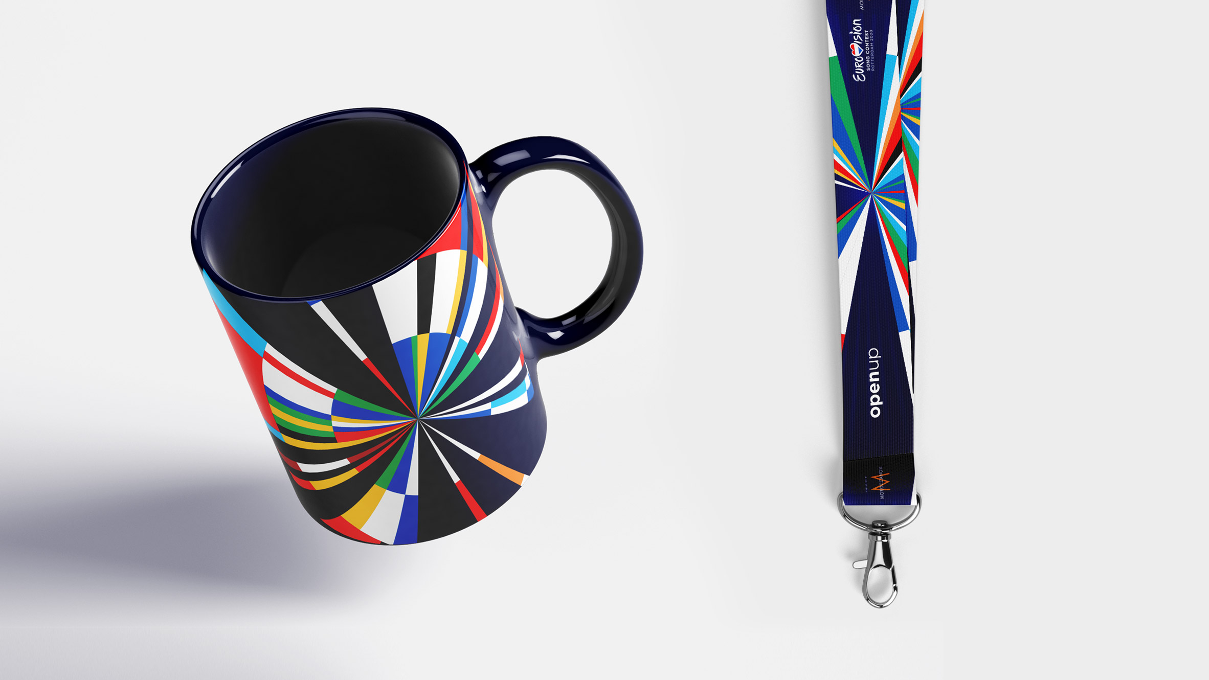
"By using software that we've developed ourselves, along with historical data, we were able to design an iconic identity that brings the history of the Eurovision Song Contest to life in a truly unique way," said Thomas Clever, co-founder of Clever Franke.
The design was then "fine-tuned" by hand to make it a coherent design, as using all the colours from the flags did not immediately "create a holistic identity".
The years in no additional countries joining the Eurovision fold have been left blank, creating a gap in the colourful pinwheel.
For example there is a gap in the circle design from 1974 when Greece joined – shown as a blue, white and blue segment to represent the country's flag at where 4pm would be on a clock face – until 1981 when Cyprus joined.
Between 2008 and next year's event, only Australia has joined the contest, so the blue, white and red of their flag forms the only segment in that section of the circle.
Clever Franke looked at various different ways that they could represent the data relating to the event and its participants before settling on the flags.
"Finding a dataset to generate an identity consistently for 41 countries is hard to come by," explained Clever. "We explored many directions such as using 'data' from songs (tempo, rhythm, etc) and various demographic datasets."
The design builds on those of the three previous editions of the Eurovision Song Contest that were held in the Netherlands, in 1970, 1976 and 1980. The visual identity for all three events centred around a circle.
The Eurovision Song Contest was established after the second world war, as a way of uniting Europe through music. It will celebrate its 65th anniversary next year.
"The Eurovision Song Contest is a celebration of sovereign mentalities," said Clever. "Rather than looking at what divides us, we aimed to create something that unifies."
Whilst often seen as a celebration of kitsch and camp, Clever believes this has often clouded the way that people look at design for the event, which is often joyful.
"The Eurovision Song Contest has seen some very exciting identities, design applications and spectacular decors. I think a lot of people tend to focus on the kitsch and the latter is not often recognised," he said.
"It is easy to fall into the trap of cynicism, but once you get in the genuine mindset of positivity and playfulness, the expression of joy comes automatically."
Clever Franke is a data-driven design agency with offices in Chicago, Dubai and Utrecht, that combines data with technology to create design solutions.
The Eurovision Song Contest will take place in the Netherlands next year. Dutch branding agency Studio Dumbar recently completed a new visual identity for the country that replaces the "touristy idea" of the tulip for a more stylised version that subtly emerges from the letters NL.
The post Eurovision 2020 visual identity combines song contest participant's national flags appeared first on Dezeen.
https://ift.tt/2QTCg2N
twitter.com/3novicesindia
No comments:
Post a Comment