In this week's comments update, readers voice their thoughts about the influence of Zaha Hadid on the afrofuturist architecture in new Marvel movie Black Panther.
Wakanda forever: production designer Hannah Beachler told Dezeen that visits to Zaha Hadid buildings informed the aesthetic of Wakanda, the fictional country featured in Black Panther, which some Dezeen readers hadn't picked up on.
"Love the sets in this film, now I know why," wrote a newly-informed Hunter Wells.
ArchitecturalDesigner felt the claims were a stretch: "I'm really struggling to see the Zaha influence. I haven't actually seen the film but from the stills, any architectural suggestion looks a bit arbitrary."
"The overt characteristics of Zaha Hadid structures combine in a utilitarian way curved, futuristic structures with references to natural elements" responded, Cy Husain, who clearly saw a link.
"Skyscrapers with thatched roofs? You seriously want to discuss architecture there?" pointed out Dandy incredulously.
"The thatch is made of vibranium – you know what that does to the building," fired back Spadestick, cheekily referencing the miracle metal in the movie.
M Lindbergh indicated that some people needed to take the situation less seriously: "This is a Marvel fiction movie, nothing usually makes sense in their movies. On a separate note, glad Zaha Hadid continues to inspire."
This reader felt the Hadid's influence was a perfect match for Wakanda.
What did you make of the architecture in Black Panther? Join the discussion ›

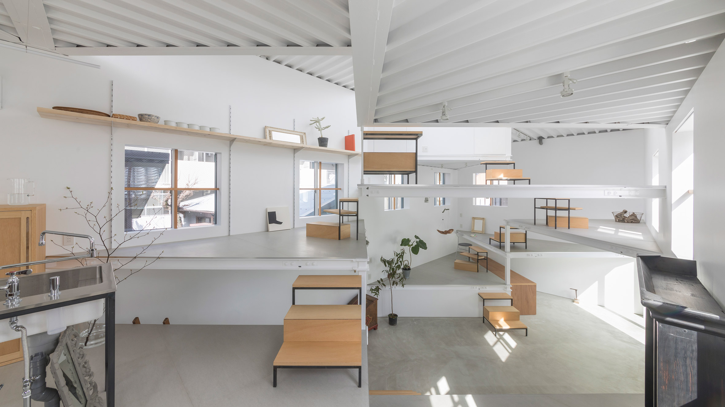
Trip hazard: commenters seemed perplexed by Tato Architects' one room-house in Osaka, which uses angular platforms for different functions. Many were also concerned about the perceived lack of privacy.
"Entirely bizarre. It would only heighten my anxiety levels if I lived there," wrote Mr Walnut Grey.
"Not many secrets or privacy possible in that kind of set up," added Red by choice.
"I like the creativity here, but the tenant clearly hasn't considered coming home drunk from the pub. Tripping hazards galore."
"Your surviving children will go on to a career with Cirque du Soleil," joked Obesa Adipose
John the Faptist added "I don't want my friends or family to be able to see me taking a dump. This is absurd."
"But the toilet is completely private?! If you look at the plan you can see it is behind the white wall," explained Hannah.
One reader thought they had come up with a more fitting use for the building.
Read the comments on this story ›

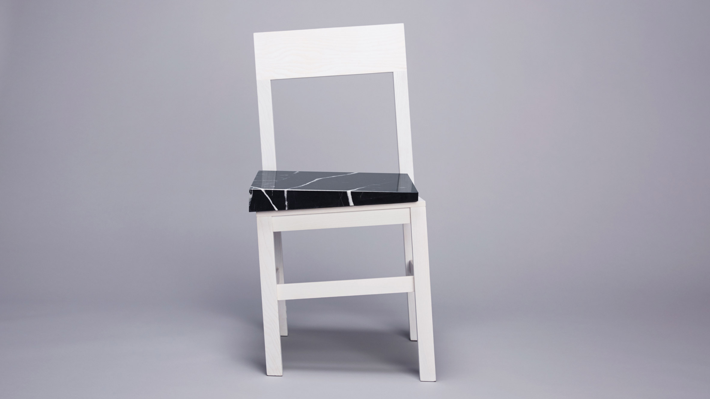
A different slant: Snarkitecture's Slip chair for Portuguese brand UVA seemed to split reader opinion, due to its unusual wonky legs and frame that appears to be slipping to one side.
"This is a cute idea and well executed," wrote a positive Iikka Keränen.
But Kek was in the opposite camp: "I'm getting dizzy just looking at it."
HeywoodFloyd felt it just was an attention-seeking design: "Screaming to be looked at, only to scream even louder when you try to ignore it."
"So many seriously pressing problems to solve in today's world and people are coming up with stuff like this," scolded Av.
One reader was clearly unimpressed.
Read the comments on this story ›

Rare breed: Lacoste's new limited-edition collection of polo shirts, created to bring attention to increasing endangered species, was a hit with the majority of readers.
"What a fantastic idea for such a worthwhile cause," beamed Marylin.
"What a great way to form an incentive for people to support the International Union for Conservation of Nature," agreed James Taylor.
But Diana was dubious of the French clothing company's motive: "While I find this a very powerful awareness campaign, I wonder how much the polo shirts went for?"
This reader seemed to share the sentiment that it's the thought that counts.
Read the comments on this story ›
The post "An iconic film deserves iconic architecture" appeared first on Dezeen.
http://ift.tt/2FgJEQZ
twitter.com/3novicesindia
No comments:
Post a Comment